


The Psychology of a Warm Welcome
Colors on the warm side of the spectrum—reds, oranges, yellows, and their earthy variations—have a unique psychological effect. Associated with the sun and fire, these hues are known to evoke feelings of comfort, joy, and energy. In design, they are often
called “advancing” colors because they appear to come toward you, which can make a large, open room feel more intimate and inviting. A splash of orange can spark creativity, yellow can promote optimism, and rich reds can increase energy. By enveloping a room in these tones, you create an inherent sense of coziness that doesn't rely on being filled with objects.
Beyond Primary Colors: Earthy Palettes
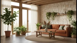
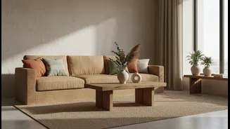
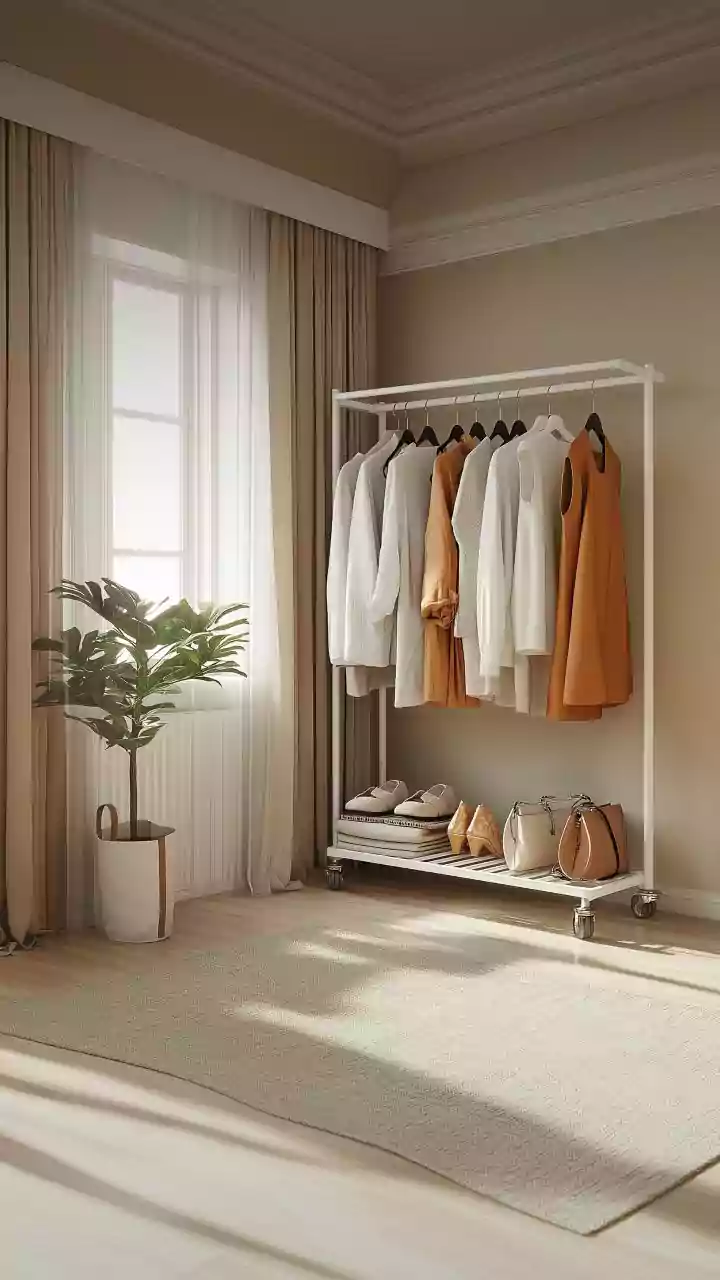
When we talk about a warm palette, we’re not just talking about bright yellow or fire-engine red. The modern approach to warm minimalism embraces a sophisticated range of earthy and muted tones. Think of shades like terracotta, ochre, rust, sand, and camel. These colors, derived from natural pigments like clay and minerals, provide warmth while also feeling grounded and serene. A palette of warm whites, creams, and beiges can form a soft, glowing foundation, preventing a minimalist space from feeling stark. These complex neutrals have subtle red or yellow undertones that add depth and a welcoming feel even before a single piece of furniture is added.
Let Your Walls Do the Talking
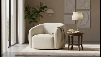
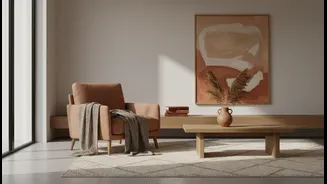
One of the most impactful ways to use a warm palette is on your walls. Painting a room in a soft terracotta or a warm greige (a mix of grey and beige) instantly creates a cocooning effect. This rich backdrop makes the entire room feel like a complete and intentional statement. With such a strong foundation, you no longer need an array of decorative items to make the space feel finished. The color itself becomes the main feature, allowing the few objects you do have—a simple sofa, a beloved piece of art—to stand out with greater purpose. A single, large piece of art with warm tones can anchor a room without creating clutter.
Texture Is the New Pattern
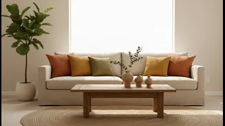
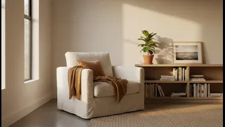
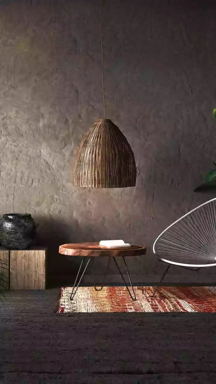
With fewer objects, the ones you choose matter more. In a warm minimalist setting, texture becomes crucial for adding depth and interest. Instead of patterns, focus on the tactile quality of your materials. Pair your warm color palette with natural textures like wood, linen, wool, rattan, and leather. Imagine a soft wool throw on a simple couch, light filtering through linen curtains, or the rustic finish of a terracotta planter. These materials engage the senses and enhance the cozy atmosphere created by the color scheme. The interplay of a warm palette and rich textures makes a room feel layered and thoughtfully curated.
Curate, Don't Collect
This design philosophy encourages intentionality over accumulation. When your color palette provides the warmth, you are free to select fewer, more meaningful objects. Each item should serve a purpose or bring you joy. A beautiful wooden bowl on a coffee table, a single sculptural vase on a shelf, or a pair of brass candleholders can make a powerful statement. The negative space—the empty areas on walls and surfaces—is just as important. It gives your chosen objects room to breathe and allows their beauty to be appreciated, reinforcing a sense of calm and order that defines intentional living.