
From 'Cluttercore' to Calm
Not long ago, the height of home style was the artfully cluttered shelf. This 'maximalist' or 'cluttercore' look involved filling every inch of space with books, small trinkets, plants, and photos. The goal was to create a rich, layered vignette that
looked collected over time. While beautiful in photos, designers and homeowners are now beginning to feel fatigued by the pressure to maintain these busy displays. The aesthetic, which once felt personal and expressive, can quickly become visual noise, making a room feel messy rather than curated. This has paved the way for a significant shift towards a more serene and edited style.
The Power of 'Less but Better'
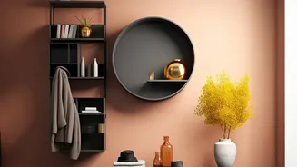
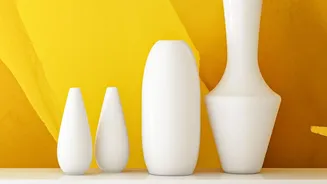
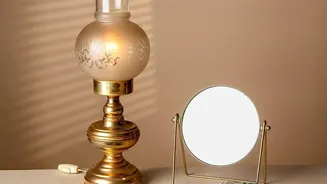
The new philosophy isn't about stark, cold minimalism; it's about intentionality. The trend reversal emphasizes using fewer but larger and more significant objects to make a statement. Instead of ten tiny things, one beautiful, sculptural vase or a substantial piece of pottery creates a stronger focal point. This approach allows each object to be seen and appreciated, giving it room to breathe. The space around an object, known as negative space, is now just as important as the object itself. It gives the eye a place to rest, making the overall composition feel more calming, sophisticated, and impactful.
Choosing Your Statement Pieces
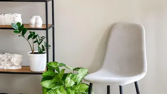
So, how do you choose the right objects? Start by editing what you already own. The goal is to select pieces that have presence, meaning, or a compelling shape. Think about scale; an object should feel substantial enough to hold its own on a shelf without needing a crowd of other items to support it. Consider items with interesting textures, such as handmade ceramics, raw wood, or woven baskets. A larger, framed piece of art leaning against the back of the shelf can anchor a display. Books are still essential, but they can be used more architecturally—stacked horizontally to create a pedestal for a single, beautiful object, for instance.
Mastering Negative Space
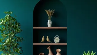
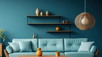
Embracing this trend requires a new appreciation for empty space. It can feel counterintuitive to leave parts of a shelf bare, but this is the key to achieving a high-end, curated look. A good rule of thumb is to aim for at least 30-40% of the shelf's surface to remain visible. This negative space stops a collection from looking like a storage problem and transforms it into a deliberate design choice. It allows materials, like the rich, dark wood shelves that are also trending, to become a feature in their own right. Play with asymmetry; group a few items on one side of a shelf, leaving the other side open to create a sense of balance and flow.
A Practical Guide to the Edit
Ready to try it? Start by taking everything off your shelves. This gives you a blank canvas and allows you to see each object with fresh eyes. Clean the surfaces thoroughly. Next, sort your items into three piles: 'love,' 'like,' and 'let go.' Be ruthless. Only items from the 'love' pile should be considered for the final display. Begin placing your largest anchor pieces first, one or two per shelf. Then, add a few smaller, complementary items, grouping them in odd numbers like threes or fives. Vary the height and texture, but keep the color palette controlled. Step back frequently to assess the balance. If it feels too busy, the most effective design trick is often removing just one more thing.