
The High-Energy Allure of Neon
Let’s be clear: there is a time and a place for a bold, neon tropical print. That lime green monstera leaf or vibrant pink hibiscus pattern can feel like an instant vacation, injecting pure, unfiltered summer energy into a room. For a few sun-drenched
months, these prints are the life of the party, transforming a patio into a resort-style oasis or adding a playful splash to a sunroom. The problem isn’t their vibrancy; it’s their inflexibility. Neon prints are a seasonal declaration. They scream summer so loudly that they can feel out of place and jarring once the days grow shorter and the mood shifts. That electric-blue palm tree cushion that looked so chic in June often clashes with the cosy, warm textures we crave in October.
The Grounded Charm of Earth Tones
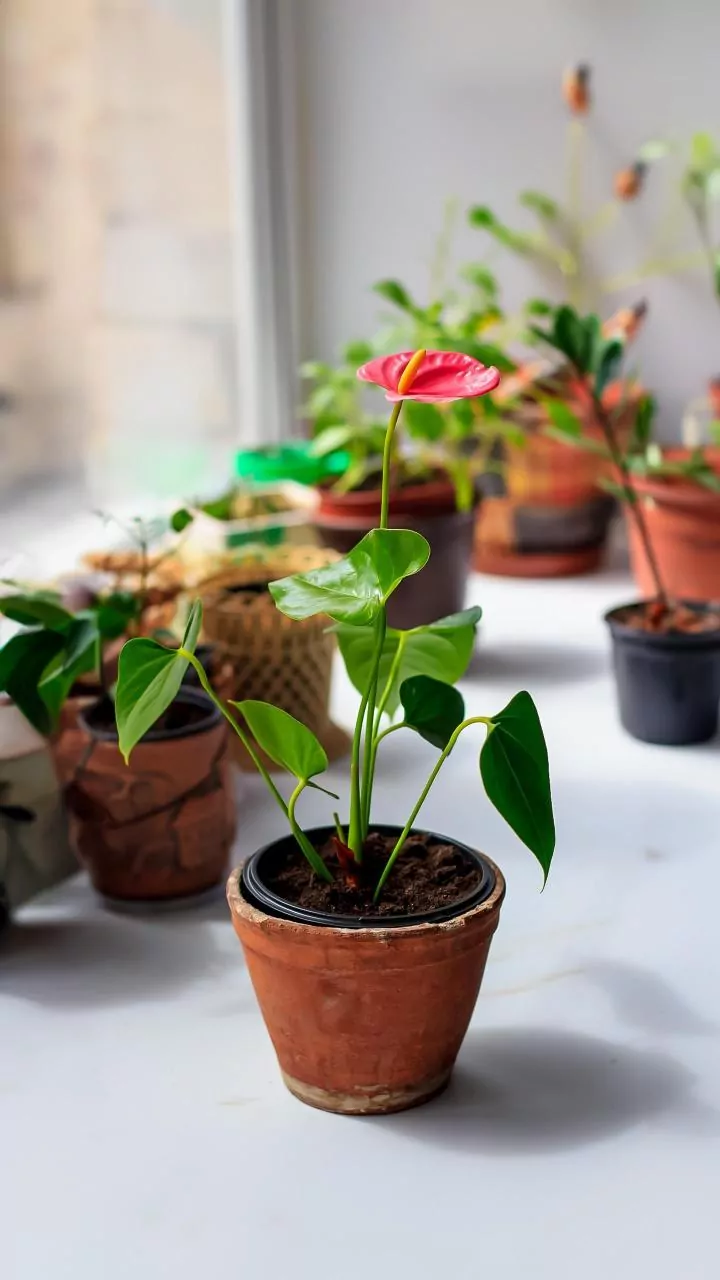
Enter muted olive and terracotta. These colours, drawn directly from the natural world, possess an inherent warmth and sophistication. An olive branch motif or a pattern inspired by terracotta tiles feels grounding and serene. Unlike neons that demand attention, these earthy tones create a sense of calm and stability. Interior design trends for 2026 show a significant shift away from cool greys and toward these warmer, more organic palettes that enhance well-being. They connect our indoor spaces to the outdoors in a subtle, enduring way, evoking everything from Mediterranean hillsides to the rich soil of a garden. This connection to nature gives them a timeless quality that trend-driven neons often lack.
The Art of the Seamless Seasonal Shift
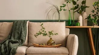
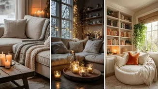
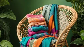
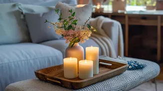
The true genius of an olive and terracotta botanical print lies in its transitional power. These palettes are masterful chameleons. In the summer, pair a terracotta-patterned throw with light linen fabrics and creamy whites to create a breezy, sun-baked feel. An olive print cushion can look fresh and vibrant next to natural materials like rattan and jute. When autumn arrives, that same terracotta pattern suddenly feels cosy and perfectly suited to the season. You can deepen the look by layering it with richer textures like wool, velvet, or boucle. The olive print that felt like a shady grove in July now reads as a deep, evergreen forest in December. This adaptability is something neon tropicals can’t replicate; their summery vibe resists being paired with chunky knits and wintry jewel tones.
How to Weave These Prints Into Your Home
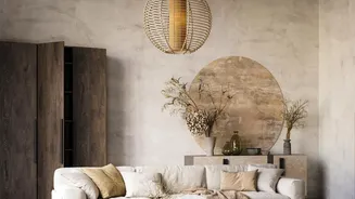
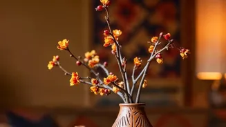
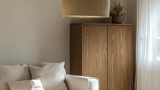
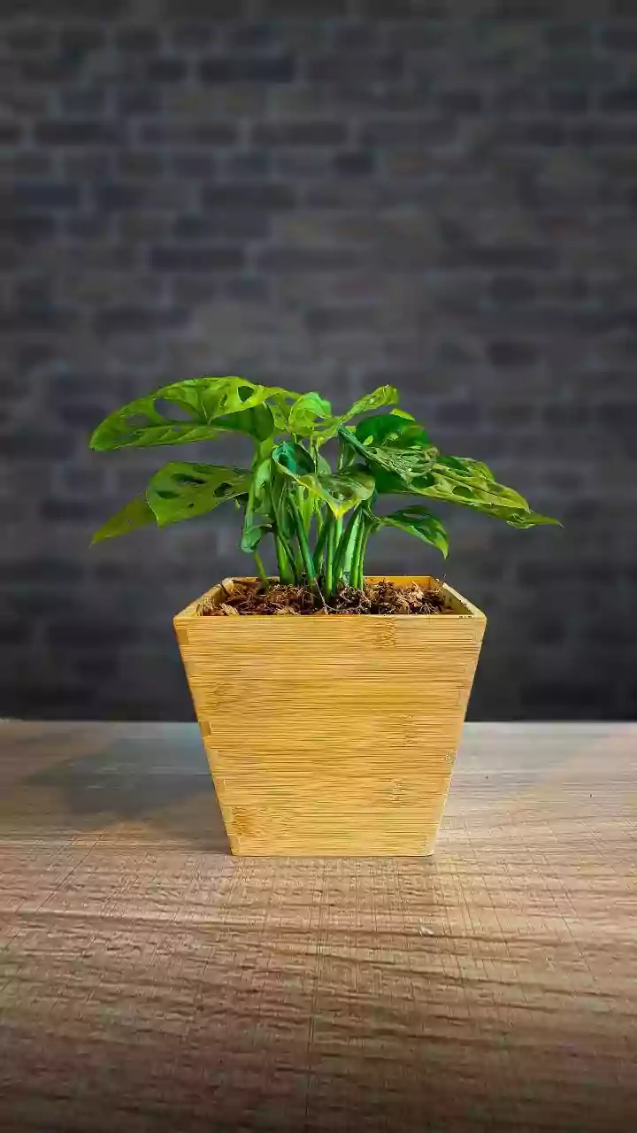
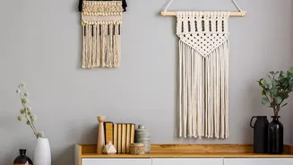
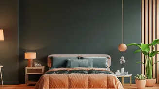
Incorporating these versatile botanicals doesn’t require a complete redesign. Start small to see a big impact. A pair of cushions on a neutral sofa, a single piece of framed botanical art, or a ceramic vase can introduce the palette gracefully. These prints work beautifully with materials you likely already own, such as wood furniture and neutral-coloured walls. For a bolder approach, consider an accent wall with a sophisticated olive-leaf wallpaper or a large area rug that anchors the room in earthy tones. In the bedroom, these colours create a serene, restful atmosphere, while in a dining space, they make for an elegant and welcoming tablescape. The key is to balance the pattern with plenty of neutral, calming spaces to let the botanicals breathe.