




The Golden Rule: Hang at Eye Level
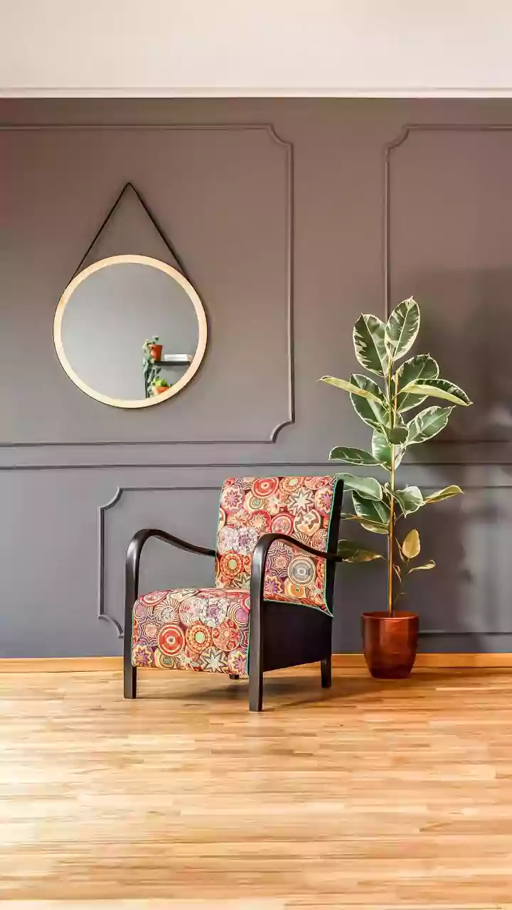
The single most common mistake in hanging art is placing it too high. It should feel connected to the room and its inhabitants, not floating near the ceiling. Interior designers and museum curators follow a simple guideline known as the '57-inch rule'.
This rule dictates that the vertical centre of the artwork should be 57 to 60 inches from the floor, which represents the average human eye level. This standard creates a comfortable and natural viewing experience, anchoring the art to a human scale regardless of your ceiling height. To find this spot, measure the height of your artwork, divide it by two to find the centre, and then ensure that this centre point rests at the 57-inch mark on your wall. This simple measurement is the secret to making your home look professionally styled.
Adjusting for Furniture and High Ceilings
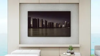
Of course, rules have exceptions. When hanging a large piece above furniture like a sofa, bed, or console table, the relationship between the objects is crucial. The goal is to create a cohesive unit. A good guideline is to leave about 6 to 8 inches of space between the top of the furniture and the bottom of the frame. This connects the two pieces visually without making the arrangement feel cramped. For artwork above a bed, this might increase to about 24 to 36 inches above the headboard. In rooms with very high or vaulted ceilings, you can hang the art slightly higher—perhaps with its centre at 60 to 62 inches—to better suit the scale of the space, but ensure it still feels anchored by furniture below.
The Power of Negative Space
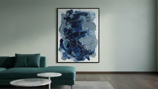
Equally important as height is the concept of negative space—the empty area surrounding your artwork. A large piece of art needs room to breathe to command the attention it deserves. When an oversized piece is crammed onto a wall that is too small or cluttered with other decor, it feels choked and overwhelming, and its impact is lost. The empty space around the frame acts as a secondary, invisible frame, isolating the subject and drawing the viewer's eye towards it. This is why a dramatic, large-scale piece often works best as the sole focus of a major wall, like the one above a fireplace or sofa. Giving the art its own space ensures it becomes a deliberate focal point rather than just more clutter.
Balancing the Entire Wall
Think of your large artwork as the anchor of the entire wall. To maintain balance, consider the 'two-thirds rule', especially when placing it over furniture. Ideally, the artwork should be about two-thirds to three-quarters the width of the sofa or console table beneath it. This proportion ensures the art feels substantial enough for the space without overpowering the furniture. If you place a small piece over a large sofa, it will look lost and unfinished. The surrounding emptiness, or negative space, should feel balanced on all sides. Don't be afraid to leave some walls completely empty. This makes the walls that do feature art feel more special and intentional, creating a cleaner, more sophisticated look.
Common Pitfalls to Avoid
Beyond height and spacing, a few other common errors can undermine your efforts. First, ensure you are using the correct hardware; large art can be heavy, and proper hooks or anchors are essential for safety. Second, consider the lighting. Avoid hanging art in direct sunlight, which can cause fading, and consider adding a dedicated picture light to make the colours pop. Finally, before you make any holes, test your placement. You can cut a piece of paper to the size of your art and tape it to the wall to see how it feels in the space. This simple step can save you from the frustration of unnecessary holes and help you hang your art with confidence.