


Anchor Your Space with a Neutral Foundation
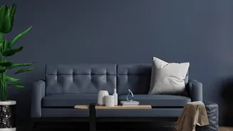
The first step to successfully incorporating a bold pattern is to give your eyes a place to rest. Your soft, neutral rug and furniture are not just a backdrop; they are the foundation that makes the entire look possible. Think of these larger pieces in shades
of beige, cream, grey, or oatmeal as the canvas. This neutral base creates a feeling of calm and openness, ensuring that the vibrant Batik cushions become a deliberate, eye-catching accent rather than a source of visual chaos. A quiet foundation allows the statement pieces—your cushions—to truly shine and tell their story.
Let the Pattern Guide Your Colour Palette
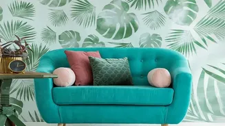
Once your neutral base is set, look closely at your Batik cushions. Their intricate designs often feature a variety of colours. Choose one or two of these secondary shades from within the pattern to repeat in small doses around the room. This is a professional design trick to create a cohesive, intentional look. For example, if your Batik has hints of deep green or terracotta, you could introduce that same colour in a vase, a picture frame, or a small piece of artwork. This creates a subtle thread that ties the bold cushions to the rest of the space, making the design feel unified and harmonious.
Apply the 60-30-10 Colour Rule
A timeless interior design principle, the 60-30-10 rule is a simple way to guarantee a balanced space. In this scenario, your neutral furniture, walls, and rug make up the 60% dominant portion of the room's colour scheme. The 30% secondary colour could be another neutral or a soft complementary shade found in curtains or an accent chair. Your bold Batik cushions then become the powerful 10% accent. This formula ensures the cushions provide that pop of personality and visual interest without overpowering the room's serene foundation. It takes the guesswork out of creating a polished look.
Master Scale and Repetition
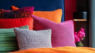
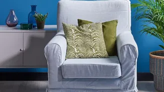
How you use the pattern is as important as the pattern itself. Avoid using too many different patterns, which can make a room feel busy. If you have multiple cushions, consider mixing one or two Batik-patterned ones with several solid-coloured cushions pulled from your neutral or accent palette. This balances the look and provides that necessary visual breathing room. Pay attention to the scale of the print. A large-scale Batik pattern can serve as the 'hero' element, while smaller, more subtle patterns or solids play a supporting role. This variation in scale creates rhythm and depth.
Layer with Complementary Textures
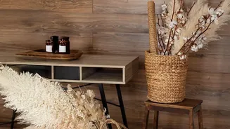
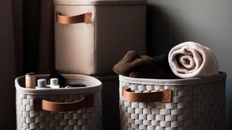
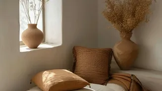
A room dominated by neutral colours can sometimes feel flat, but texture is the perfect remedy. Think about the interplay between the different materials in your space. The soft weave of your neutral rug, the smooth fabric of your sofa, the potential coarseness of a linen cushion, and the rich cotton of the Batik all contribute to a layered, sensory experience. You might add a chunky knit throw blanket or a velvet solid-coloured pillow into the mix. These textural variations add warmth and dimension, creating a rich, inviting atmosphere that feels thoughtfully curated even within a controlled colour palette.