




The Supermarket's Silent Salesperson
Think of food packaging as the product's first sales pitch. Before you check the price or the nutrition panel, your brain has already made a snap judgment based on what it sees. Marketers and psychologists know this well. They understand that we are visual
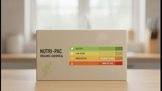
creatures, and the design of a package—its colour, shape, texture, and the words it uses—is a powerful tool to shape our perception of what's inside. This is especially true when it comes to health. A carefully designed package can create a 'health halo,' making a product seem far more nutritious than it actually is.
Decoding the Colour Code
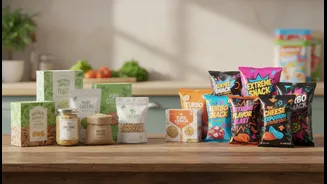
Colour is arguably the most powerful tool in the packaging arsenal. Our brains are hardwired to associate certain colours with specific ideas. Green is the most obvious example, almost universally signalling that a product is natural, fresh, organic, or sustainable. Blue and white often convey a sense of purity, lightness, or trustworthiness, which is why they are frequently used on dairy, water, and other products positioned as wholesome. In contrast, bright, saturated colours like red and yellow are designed to grab attention and stimulate the appetite, often signalling fun, flavour, and indulgence rather than health. Studies have shown that consumers often perceive foods in green or blue packaging as healthier than the exact same product in red packaging. Darker colours like black or deep purple, on the other hand, can suggest a product is premium, sophisticated, or rich in flavour.
The Power of Persuasive Words
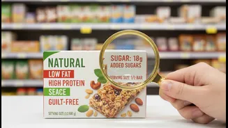
Alongside colour, the language used on packaging plays a critical role in shaping our health perception. Words like "natural," "organic," "light," "low-fat," and "zero sugar" are potent marketing tools. While some of these terms are regulated, their everyday interpretation by consumers can be much broader than their legal definition. The word "healthy" itself is a powerful but often vague claim. Recent actions by India's food regulator, FSSAI, have highlighted how brands use such terms to potentially mislead consumers. For instance, a product might be labelled "baked, not fried," but a quick look at the nutrition label could reveal high levels of sodium or sugar. Similarly, claims like "made with whole grains" might be true, but the product could still be predominantly made from refined flour. These phrases are designed to make us feel good about our choice, often encouraging us to skip a more thorough inspection of the ingredients list.
Becoming a Smarter Shopper
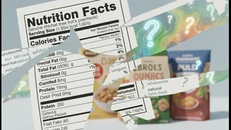
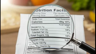
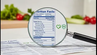
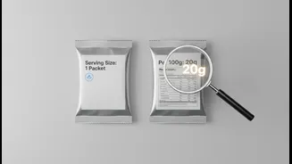
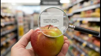
Understanding these psychological triggers is the first step to becoming a more informed consumer. The goal isn't to become cynical about all food packaging, but to learn how to see past the marketing and evaluate the product on its own merits. The most reliable source of information is not on the front of the box, but on the back. Always turn the package over and read the nutrition facts panel and the ingredients list. The ingredients are listed by weight, so the first few items make up the bulk of the product. If sugar or refined grains are at the top of the list for a product claiming to be healthy, you know the front-of-pack claims might be painting a rosier picture than reality. Pay attention to serving sizes, which can sometimes be unrealistically small to make the calorie and sugar counts seem lower. By focusing on the data rather than the design, you can take back control of your choices.