





The Non-Negotiable: Clear Pricing
A menu without prices, or one where they are intentionally obscured, creates immediate discomfort for a diner. It shifts the focus from anticipating a delicious meal to worrying about the final bill. This practice, sometimes defended as a way to make
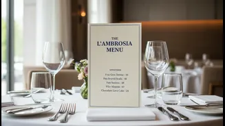
guests focus on the food's quality, often does the opposite. It can feel exclusionary and suggests the restaurant is not confident in the value it provides. Studies and menu engineers agree that transparent pricing builds trust. While some high-end establishments might strategically remove currency signs to lessen the 'pain of paying,' this is different from hiding the cost entirely. The best approach for most restaurants is to list prices clearly and simply next to the dish description. It’s a sign of respect for the customer, allowing them to make informed choices without embarrassment or anxiety.
The Power of Thoughtful Spacing
A cluttered menu is a stressful menu. When text, descriptions, and prices are crammed together, it creates cognitive overload. This makes it difficult for customers to navigate their options and often leads to 'decision paralysis', where they default to a familiar or simple choice rather than trying a new, potentially more profitable dish. Effective menu design uses white space—the empty areas around text and images—to guide the eye and create a sense of calm and order. Good spacing groups related information together, like a dish name and its description, making the layout intuitive. It helps highlight specific items without needing to resort to loud graphics. An item surrounded by a bit of empty space is naturally perceived as more important and of higher quality. A well-spaced menu feels intentional and sophisticated, signalling that the dining experience will be just as considered.
Readability Is a Form of Respect
A menu's primary function is communication, and that fails if customers can't easily read it. Choosing a font should be about clarity first and style second. Overly decorative, cursive, or novelty fonts can be frustrating to read, especially in the low lighting of many restaurants. Similarly, text that is too small or lacks sufficient contrast with the background—like grey text on a beige page—can make the menu inaccessible to many, including older patrons or those with visual impairments. Experts suggest using clean, easy-to-read fonts. Sans-serif fonts like Lato or Open Sans are often recommended for their modern, approachable feel and high legibility. If a more traditional feel is desired, classic serif fonts like Garamond are excellent for print, as they are renowned for their readability in blocks of text. Ultimately, the font should match the restaurant's brand but never at the expense of the customer's ability to read it without struggle.
When Trendy Design Fails the Diner
In the quest to be unique, some restaurants adopt menu formats that are more gimmicky than helpful. Think menus printed on chalkboards across the room, on heavy wooden blocks, or presented exclusively through a clunky QR code that leads to a poorly formatted, multi-page PDF you have to pinch and zoom on your phone. While novel ideas can create a memorable moment, they often fail the basic test of usability. A menu should not be a puzzle to be solved. If the design makes it hard to find sections, compare dishes, or see the prices, it has failed. The goal should be to enhance the dining experience, not detract from it with unnecessary friction. A simple, well-organized, and legible menu is a timeless tool that always works.