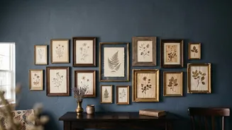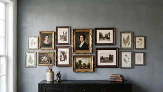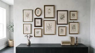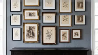

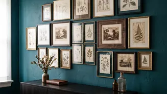
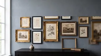
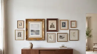
Living in a small space often feels like a puzzle with too many pieces. How do you inject personality without creating clutter? A vintage gallery wall isn't just decoration; it's a strategic design tool that tells your story and expands your space.
The Main Point: Creating a Focal Anchor
The
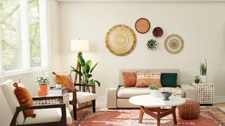
main point of a vintage gallery wall in a small home is to create a powerful focal point that makes the entire room feel more intentional and expansive. Instead of scattering small items, which can make a space feel busy and cluttered, a curated collection of art functions as a single, cohesive statement. This grouping draws the eye inward and upward, creating an illusion of depth and height. It's a design trick that replaces blank, undefined walls with a rich visual story, giving the room a sense of history and personality that mass-produced decor cannot replicate. A well-executed gallery wall anchors the space, making it feel deliberately designed rather than simply occupied.
Sourcing Your Vintage Treasures Affordably
Building a collection with character doesn't require a massive budget. The thrill is in the hunt. Thrift stores, antique malls, and flea markets are classic grounds for discovery, where you can find unique paintings and prints for a fraction of gallery prices. Online marketplaces like eBay, Etsy, and even Facebook Marketplace have become treasure troves for affordable vintage art, though you'll need to dig. For a truly budget-friendly option, explore online public domain archives from museums, which offer high-resolution images you can print yourself. You can also find beautiful, inexpensive frames at thrift stores and pair them with new prints, or vice-versa. Don't overlook pieces with dated frames; often, a beautiful painting is hiding behind tired matting.
Curation: Weaving a Cohesive Story
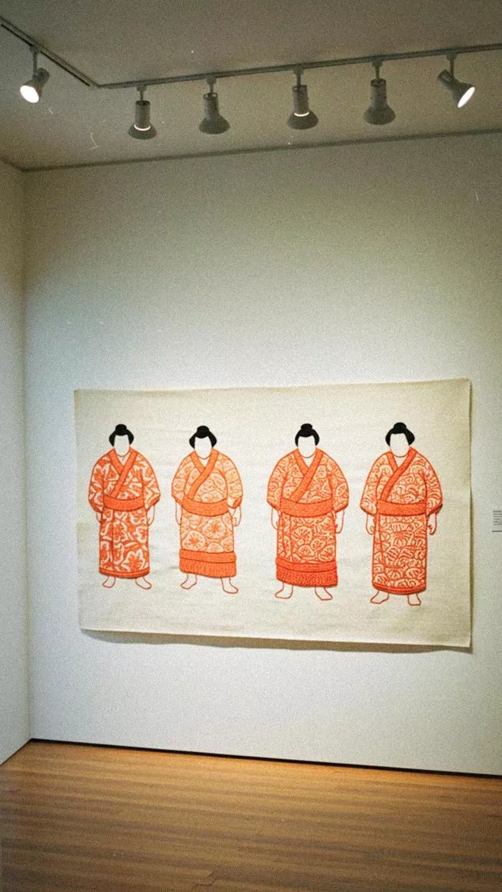
The secret to a gallery wall that looks collected rather than chaotic is cohesion. Start by choosing a unifying element. This could be a consistent color palette (like warm earth tones or black and white), a repeated frame style (such as all brass or all dark wood), or a common theme (like landscapes, portraits, or botanical sketches). You don't need to match everything perfectly. In fact, the most interesting walls mix different mediums, such as paintings, prints, mirrors, and even textiles or small sculptural items. The goal is to create a visual conversation between the pieces, where repetition of one or two key elements provides a rhythm for the eye to follow.
The Art of Arrangement and Layout
Before a single nail hits the wall, plan your layout. The most effective method is to trace each frame onto craft paper, cut out the shapes, and tape them to the wall with painter's tape. This allows you to experiment with placement without commitment. A common mistake is hanging art too high; the center of the entire arrangement should be at roughly eye level, about 57-60 inches from the floor. If hanging above furniture like a sofa, the lowest frame should be 6 to 8 inches above it, anchoring the art to the furniture. Don't be afraid to mix sizes, but use your largest piece as an 'anchor' and build the smaller frames around it. Keep the spacing between frames tight and consistent—around 2 to 3 inches—to ensure the collection reads as one unit.
Installation Without the Stress
For renters or those hesitant to create multiple holes, modern solutions make hanging a gallery wall easier than ever. Adhesive picture-hanging strips are a popular choice for lightweight frames and can be removed without damaging most wall surfaces. Another option is a picture ledge or a set of narrow floating shelves. This allows you to lean and layer frames, offering maximum flexibility to rearrange your collection whenever you like. You can also mix in small plants or decorative objects for added dimension. If you are using nails, a vertical stack in a narrow space can draw the eye up, making ceilings feel higher and is an excellent use of often-ignored wall real estate.