





Understanding the Batik Spectrum
At its core, the difference between subtle and vibrant batik lies in colour, scale, and pattern density. Subtle batiks often feature monochromatic palettes, muted earth tones, or soft pastels. Their patterns, which might include fine lines or small, repeating
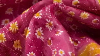
motifs like the geometric Kawung, have a lower contrast and more negative space, creating a gentle visual rhythm. Vibrant batiks, on the other hand, are defined by their bold, high-contrast colours and large-scale motifs. Think of the brilliant blues of a Mega Mendung (cloud) pattern or the rich, colourful florals of Pekalongan designs. These patterns are designed to capture attention and make a statement.
Crafting Calm with Subtle Patterns
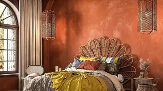
To create a sanctuary for rest and relaxation, subtle batik is your greatest ally. Patterns with soft, curved lines and repetitive, flowing designs are known to have a soothing psychological effect. These designs reduce visual fatigue and promote a sense of order and harmony. Use batiks in muted blues, soft greys, and earthy browns for bedrooms, studies, or reading nooks. A bedspread with a delicate Parang motif in a muted tone or curtains with a light, airy pattern can introduce texture and warmth without overwhelming the space. The goal is to create a layered, serene backdrop that feels calm and inviting.
Injecting Energy with Vibrant Designs
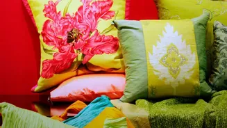
When a room needs a dose of personality and energy, vibrant batik is the answer. Bold, high-contrast patterns and bright colours stimulate the senses and can make a space feel more lively and social. This makes them perfect for living rooms, dining areas, and hallways where you want to spark conversation and create a focal point. A single armchair upholstered in a colourful batik, a large framed piece of fabric as wall art, or a set of lively cushions on a neutral sofa can instantly transform a room. Patterns like Sekar Jagad ('map of the world') or those with bold floral or animal motifs bring a sense of joy and dynamism.
Matching Pattern to Room Function
The function of the room should be a key guide in your selection. For a home office where focus is key, a subtle geometric pattern can aid concentration without being a distraction. In contrast, a child's playroom can come alive with the most colourful and playful patterns available. For a guest bedroom, a subtle and calming design in a soft blue can create a welcoming and comfortable feel for any visitor. Don’t be afraid to use vibrant patterns in unexpected places, like the back wall of a closet or as a shower curtain, to add a delightful pop of colour where it's least expected.
The Art of Mixing and Balancing
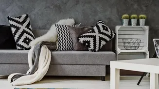
You don't have to choose one or the other. The most sophisticated interiors often blend both subtle and vibrant elements. The key is balance. If you have a large, vibrant batik as a wall hanging, keep the surrounding elements more neutral to let the artwork shine. Conversely, in a room with a lot of subtle, tone-on-tone texture, a few vibrant batik cushions can provide the perfect accent. Pair a floral or organic batik pattern with solid-coloured furniture to create balance. The interplay between a quiet background and a bold foreground creates a dynamic and personalised space that feels both curated and comfortable.