
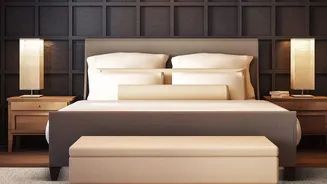
The Fading Appeal of the Beige Empire
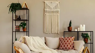
There’s a reason why beige, cream, and greige dominated our homes for so long. They promise a serene, minimalist escape from a chaotic world. Inspired by Scandinavian simplicity and the ‘quiet luxury’ movement, these neutrals created a sense of order
and calm. However, after years of seeing the same monochrome rooms online and in magazines, what once felt calming now often feels impersonal and predictable. The overexposure has led to a design fatigue, with many homeowners feeling that these spaces, while clean, lack personality and emotional warmth. The very safety that made beige so popular has become its biggest drawback, leading to a craving for interiors that feel more alive, unique, and reflective of the people who live in them.
The Joyful Rise of 'Dopamine Decor'
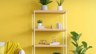
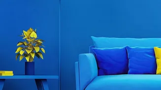
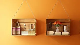
The pendulum is now swinging towards colour, driven by a trend aptly named 'dopamine decor'. Emerging from the world of fashion, this philosophy is about using colour, pattern, and texture to actively create a sense of joy and boost your mood. It’s an emotional strategy, a direct response to the monotony of minimalist interiors. The idea is to surround yourself with things that make you happy, from a brightly painted wall to a velvet sofa in a rich jewel tone. This isn't about chaos; it's about curation. The shift was accelerated by the pandemic years, which forced us to spend more time at home and reconsider our relationship with our living spaces, fuelling a desire for comfort, nostalgia, and self-expression. Homes are no longer just shelters but sanctuaries for personal expression.
What Exactly Is a Balanced Palette?
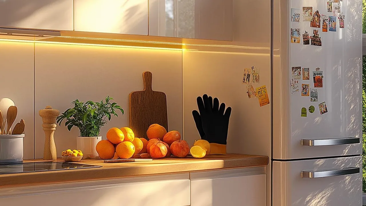
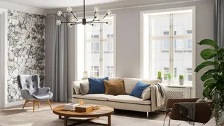
Embracing colour doesn't mean your home has to look like a rainbow explosion. The new approach is all about balance. It’s a move toward richer, more expressive combinations and layered schemes. Think less about fleeting microtrends and more about creating spaces that are grounded, personal, and emotionally restorative. A popular and effective guideline is the 60-30-10 rule. This suggests using a dominant colour for 60% of your space (like walls), a secondary colour for 30% (furniture, curtains), and a vibrant accent colour for the final 10% (cushions, art, accessories). This ensures harmony while allowing for bold choices. The goal is to create palettes that have depth and character, shifting with the light to create a space that feels dynamic and welcoming.
Tips for Welcoming Colour Home
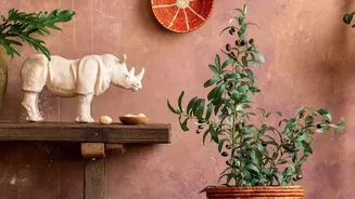
Introducing colour can be a gradual process. You don't have to repaint your entire home overnight. Start small by swapping out neutral accessories for more vibrant ones. Think about adding a colourful rug, a piece of bold artwork, or some patterned cushions. For those ready for a bigger change, painting a single accent wall in a rich hue like deep teal, emerald green, or a warm terracotta can dramatically transform a room without being overwhelming. Look to India’s own rich visual heritage for inspiration—the earthy tones of spices, the vibrant jewel tones of textiles, and the deep indigo and mustard yellow found in traditional crafts are all perfect starting points. These colours bring both contemporary style and a sense of cultural connection.
Beyond the Paint: Texture and Materials
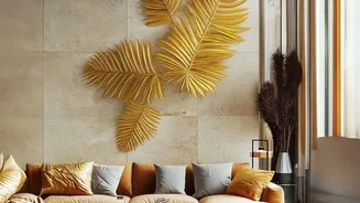
A balanced and character-filled home uses more than just colour. The new maximalism is more collected than cluttered, focusing on layers and personal stories. Texture plays a crucial role in adding depth and warmth. Pair smooth painted walls with the roughness of a jute rug, the softness of a velvet chair, or the sleekness of brass or copper accents. Materials like dark wood, natural stone, and woven textiles can ground a colourful palette, preventing it from feeling chaotic. This thoughtful layering of colour, texture, and personal objects is what ultimately creates an interior that feels not just decorated, but truly curated and reflective of your own unique story.