

The End of the 'Sad Beige' Era
For a long time, embracing a palette of beige, cream, and greige was the go-to for creating a serene and sophisticated home. It felt safe, clean, and undeniably chic. However, as design trends evolve, many are finding that a home drenched only in a single
shade of beige can feel less like a sanctuary and more like a sterile, impersonal space. Designers and homeowners alike are pushing back against what some have jokingly termed the 'sad beige aesthetic', which can strip a room of its soul and character. The trend reversal isn't about abandoning the calming power of neutrals; instead, it's about making them more interesting, dynamic, and reflective of the people who live there. It's a move toward interiors with more personality and expression.
Embrace a Tonal Palette
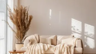
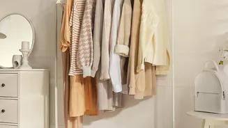
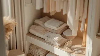
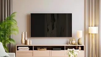
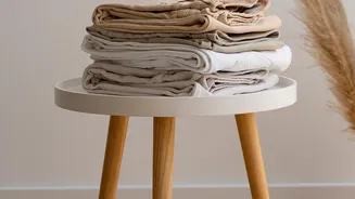
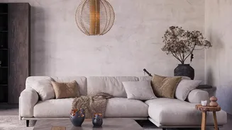
The key to modern neutral decorating is to think in terms of 'layering' rather than just 'matching'. A layered neutral palette involves blending a range of complementary soft, understated colors. Think beyond a single beige and introduce a family of related hues: warm creams, soft taupes, earthy cognacs, gentle greys, and even muted greens or dusty blues can work together to create a rich, cohesive look. Start by choosing a primary neutral that will anchor the space. Then, introduce lighter and darker variations of that tone, along with one or two other complementary neutrals, through paint, furniture, and decor. This tonal approach adds complexity and prevents the room from feeling flat or one-dimensional.
Texture Is Your Secret Weapon
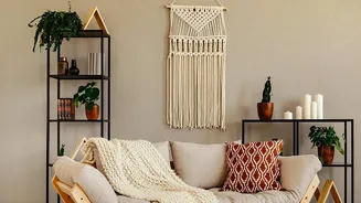
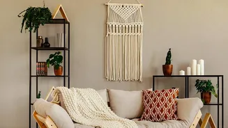
In a neutral room, texture does the work that bold color might do elsewhere. It creates visual interest, depth, and a crucial sense of warmth. The goal is to create a tactile experience. Mix a variety of materials to delight the eye and the touch. Contrast the softness of a boucle sofa with the roughness of a linen curtain, the smoothness of a marble coffee table with the organic grain of a wooden side table, or the plushness of a wool rug with the natural weave of a rattan chair. These different surfaces catch light in unique ways, adding subtle variation and preventing the neutral palette from looking boring. This focus on tactility makes a space feel more considered and comforting.
Mind the Shape of Things
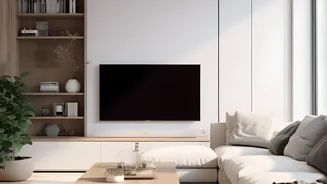
When your color palette is restrained, the shape and form of your furniture and decor objects become much more significant. A layered neutral scheme provides the perfect backdrop to appreciate the silhouette of a beautifully designed piece. Play with a mix of shapes to create a dynamic look. For instance, pair a sofa with soft, rounded curves with a sharp, linear bookcase. Place a sculptural, organically shaped lamp on a clean-lined console table. This interplay of forms adds another layer of interest that keeps the eye moving and engaged, proving that a space can be both calming and stimulating at the same time. The focus shifts from color to craftsmanship and design.
Ground the Space with Contrast
A room with only light and mid-tone neutrals can sometimes feel like it's floating. To give your space a sophisticated, grounded feel, it’s important to introduce a point of contrast. This doesn't require a splash of bright color. Instead, incorporate small but deliberate touches of dark, deep tones like charcoal, black, or chocolate brown. This can be achieved through picture frames, the legs of a chair, a single dark cushion, or a piece of art. These dark accents act as anchors, helping the other neutral tones to stand out more clearly and adding a layer of graphic punch that makes the entire design feel more intentional and complete.