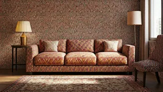


Anchor Your Vision With a Hero Print
The first step to mastering pattern is to choose one hero print to be the star of the show. This could be a bold floral wallpaper, an intricate geometric rug, or a vibrant piece of upholstered furniture. This dominant pattern sets the tone and colour
story for the entire room. By selecting this primary piece first, you create an anchor around which all other elements can be built. Every other pattern and solid colour you introduce should complement this hero print, not compete with it. This approach ensures your design feels intentional and cohesive, preventing the visual chaos that happens when too many bold patterns fight for attention.
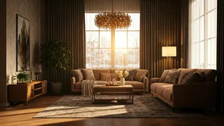
Follow the 60-30-10 Rule
A classic interior design principle, the 60-30-10 rule, is your best friend when mixing patterns. Here's how it works: 60% of your room should be a dominant colour (often your walls and large furniture), 30% a secondary colour or texture, and the final 10% is your accent. You can apply this logic to patterns. Let your hero pattern be part of the 30% or 10% slice, depending on its boldness. The remaining space, the 60%, should be filled with solids or very subtle textures that provide breathing room. This creates a balanced visual hierarchy, allowing the eye to move comfortably through the space without feeling overwhelmed.
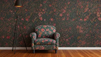
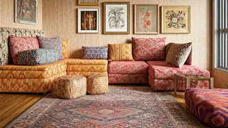
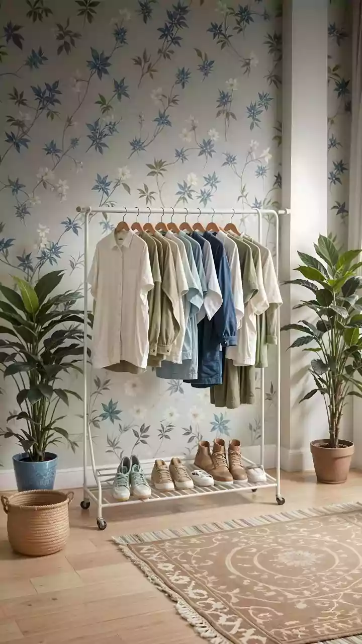
Vary the Scale of Your Patterns
One of the most common mistakes in decorating is using multiple patterns of the same size, which makes a room feel busy and flat. The secret is to vary the scale. Combine large-scale, medium-scale, and small-scale prints. For instance, if your hero print is a large-scale floral on your curtains, pair it with medium-scale geometric cushions and a small, delicate print on a lampshade. This contrast in size creates depth and allows each pattern to stand on its own while contributing to a unified look. A good rule is to ensure a clear hierarchy so that no two patterns of a similar scale are placed right next to each other.
Unify with a Cohesive Colour Palette
Even the most diverse patterns can live harmoniously together if they share a common colour palette. Before you start mixing, decide on a colour scheme of two to three main hues. Use your hero pattern as a guide to pull out these colours. For example, if your block-printed bedspread has shades of blue, mustard, and cream, ensure your other patterns—be it stripes or paisleys—incorporate one or more of those colours. This shared colour story acts as a thread that ties everything together, making the mix feel deliberate and sophisticated, rather than random and jarring.
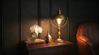
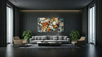
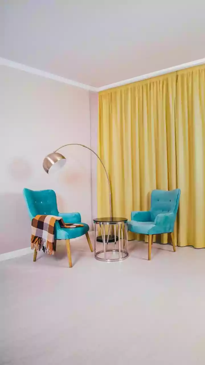
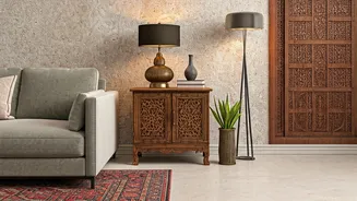
Embrace Solids and Negative Space
Patterns need room to breathe. Without solid colours to act as a visual pause, even the most beautiful prints can become overwhelming. Think of solid-coloured surfaces—like a neutral sofa, plain walls, or a simple rug—as the canvas that allows your patterns to shine. These “negative spaces” are just as crucial as the patterns themselves. In a room rich with traditional Indian textiles and carvings, strategically placing solid elements creates balance and prevents the space from feeling cluttered. This contrast highlights the intricacy of your chosen patterns, making them focal points rather than noise.
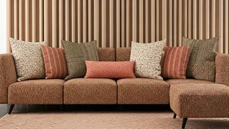
Start Small and Layer Up
If you're hesitant to go all-in with a patterned wallpaper or sofa, start small. Introducing patterns through smaller, less permanent items is a great way to experiment. Begin with throw cushions, a table runner, a single piece of framed textile art, or a dhurrie. These elements can add a pop of colour and personality without a major commitment. You can then layer more patterns as your confidence grows. This approach is particularly effective in compact urban apartments, where a few well-chosen patterned accents can add character without visually shrinking the space.