
The Fading Appeal of Flat Luxury
The all-beige interior had a good run, and for valid reasons. It offered a clean, calm, and sophisticated backdrop that felt safe and effortlessly luxurious. During the 'quiet luxury' craze, a room drenched in a single neutral tone became visual shorthand
for high-end taste. However, as with any trend that reaches a fever pitch, a correction was inevitable. Designers note that when everything is one-note, a room can lose its warmth and personality, beginning to feel anonymous and even sterile. The collective craving for spaces that feel more personal, expressive, and lived-in is steering us away from interiors that look perfect but lack soul. Homeowners are realising that 'safe' can quickly become 'boring'.
Why Texture Is the New Design Hero
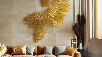
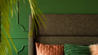
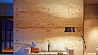
Texture, in design, refers to the surface quality of a material—both how it feels to the touch (tactile) and how it appears to the eye (visual). Think of the difference between a smooth leather sofa, a nubby bouclé chair, a rough-hewn wooden table, and a sleek glass partition. Without this variety, even a beautifully coloured room can feel one-dimensional. Texture is what adds depth, dimension, and interest. It’s the secret ingredient that prevents a space from feeling flat. Beyond just looking good, texture has a powerful psychological effect. Soft materials like linen, wool, and velvet create a sense of coziness and relaxation, while harder surfaces like stone and metal add structure and modernity. It allows you to build a multi-sensory experience that is emotionally captivating.
How to Layer Materials Like a Pro
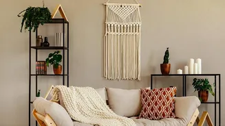
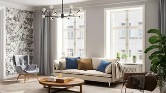
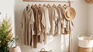
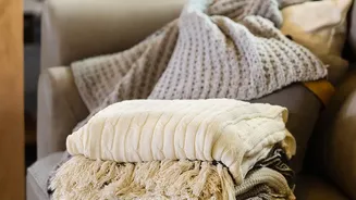
The key to embracing this trend is layering. This doesn't mean you need to abandon your neutral palette; in fact, texture shines within a restrained colour scheme. The goal is to create contrast and balance. Start by mixing different textiles. If you have a smooth sofa, add a chunky knit throw and a pair of velvet cushions. On the floor, a high-pile rug can anchor the room and provide a soft foundation. But don't stop at fabrics. Juxtapose soft materials with hard ones. Place a ceramic lamp with a matte finish on a polished wood side table. Hang gauzy linen curtains to soften a window frame. In India, incorporating traditional materials like jute rugs, terracotta pots, or brass accents is a fantastic way to add authentic, layered texture.
It's Still Neutral, Just More Interesting
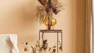
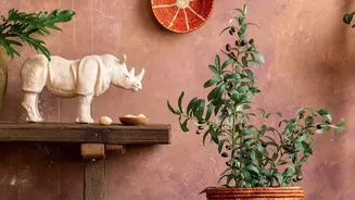
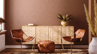
This trend reversal isn't about declaring beige a bad colour. Instead, it’s a move toward more complex and thoughtful applications of neutral palettes. Designers are embracing what they call 'layered neutrals' and 'anti-neutral neutrals'. This involves using a wider range of earthy tones like olive green, charcoal, warm woods, and terracotta to create depth without sacrificing a serene feeling. A beige wall can be the perfect canvas for a rich wooden console, a stone sculpture, and a collection of handmade ceramics. Each element, while neutral, brings its own unique surface quality, preventing the space from reading as flat. The focus shifts from the colour itself to the interplay of materials within that colour family.
Start Small, Make a Big Impact
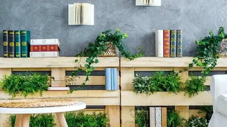
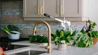
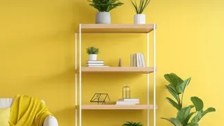
You don't need a complete overhaul to get on board. The easiest way to 'un-beige' your home is to start with accessories. Swap out matching cushions for a set with varied textures—think a mix of cotton, linen, and wool. Introduce a single 'statement' piece with a powerful texture, like a sculptural armchair in a nubby fabric or a fluted-glass cabinet. Artwork is another quick way to add both visual texture and personality. Even adding plants with different leaf shapes and sizes can introduce an organic, textural layer to a room. These small, intentional additions can make any room feel more dynamic, curated, and alive without a huge commitment.