
The Rise and Fall of the 'Shelfie'
Not long ago, the ultimate sign of a well-decorated home was a meticulously arranged bookshelf, packed from edge to edge. This was the era of the 'shelfie'—a social media phenomenon that treated shelves not as storage, but as a canvas for showcasing personality
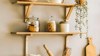
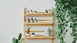
through accumulation. The look was defined by dozens of small objects, stacks of horizontally placed books (spines often turned inward), trailing plants, and a general sense of busy-ness. While visually engaging and highly Instagrammable, this trend often led to a feeling of visual noise. Designers and homeowners are now beginning to question the 'more is more' philosophy, finding that a shelf crowded with too many small items can feel overwhelming and chaotic rather than curated.
A Cultural Shift Towards Calm
The move away from the over-styled shelf isn't just a fleeting design trend; it reflects a broader cultural desire for peace and intention in our personal spaces. After years of digital saturation and sensory overload, there's a growing appreciation for homes that feel like a sanctuary. This has given rise to concepts like 'warm minimalism' and 'quiet luxury', which prioritize tranquility and quality over quantity. The focus has shifted from owning as much as possible to owning with purpose. Instead of displaying every trinket, the new ideal is to create an environment that reduces stress and cognitive load, allowing for moments of visual rest.
The Power of Fewer, Larger Objects
The antidote to the cluttered shelf is a simple but powerful principle: using fewer, but larger, objects. Instead of a dozen tiny vases, imagine one significant, sculptural piece. Rather than a jumble of small photo frames, picture one large piece of leaned art. This approach isn't about creating empty, sterile spaces; it's about giving important items the prominence they deserve. By choosing bigger decor, you create an immediate focal point and a sense of sophistication. This method forces a more intentional selection process. You’re no longer just filling space; you are curating a personal gallery where each object has a story and a reason for being there. This 'less-is-more' approach can make even a small room feel more spacious and considered.
Embracing Negative Space
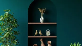
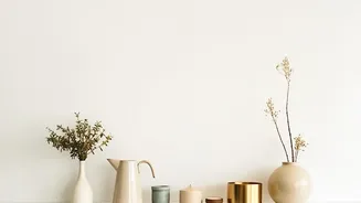
The secret ingredient in this new approach is 'negative space'—the empty areas around and between objects. Far from being wasted, this breathing room is a crucial design element. It allows the eye to rest, making the objects you choose to display more impactful. Think of it as the pause between musical notes; it provides rhythm and clarity. Well-used negative space directs attention to your focal points, prevents a room from feeling cluttered, and enhances the overall sense of harmony. A shelf with adequate negative space feels confident and serene, signaling that only what truly matters has been kept.
How to Edit Your Own Shelves
Ready to embrace this calmer aesthetic? Start by taking everything off your shelves for a clean slate. Then, shop your own home for a few 'hero' items—pieces you truly love because of their shape, texture, or personal meaning. When placing them back, think about balance and scale. Vary the heights of your objects and create small, intentional groupings. A common designer trick is to remove 30-40% of what was originally on the shelf to instantly create breathing room. Mix vertical stacks of books with horizontal ones, and use a large piece of art or a mirror as an anchor. The goal isn't rigid symmetry, but a balanced composition that feels both personal and peaceful.