

What is Colour-Blocking?
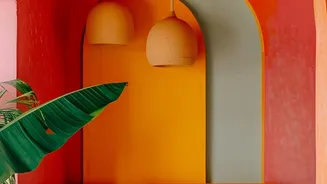
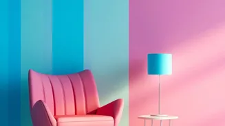
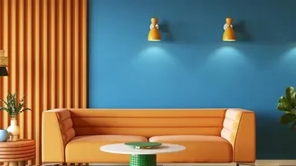
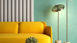
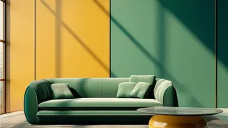
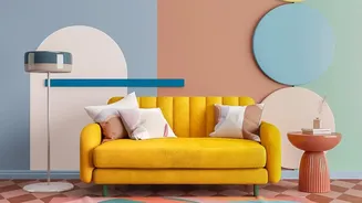
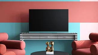
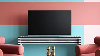
First popularised in fashion, colour-blocking is an interior design technique that uses two or more solid blocks of colour to create a bold statement. Unlike patterns or textures, its impact comes purely from the strategic placement of distinct hues.
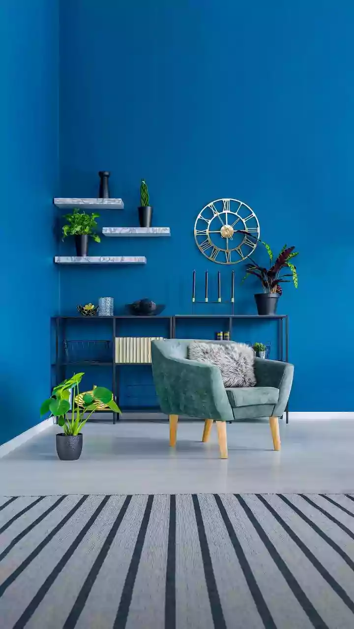
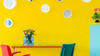
The goal is to create visual interest and structure through striking contrasts. Imagine a deep navy blue paired with a sunny mustard yellow, or an earthy terracotta grounded by a clean, crisp white. This method can be used to highlight architectural features, create a focal point, or simply add a dose of modern energy to a room that feels tired or plain. While often associated with bright, vibrant shades, colour-blocking can also be achieved with a more subtle, neutral palette.
Why Wallpaper Is Perfect for This Trend
While paint is a common way to achieve a colour-blocked look, wallpaper offers several distinct advantages. For starters, it provides perfectly clean lines without the need for meticulous painter's tape and multiple coats. Many companies now offer wallpaper designs that incorporate colour-blocking directly, taking the guesswork out of the process. Wallpaper also introduces an element of texture and depth that paint alone often cannot replicate. Best of all, the rise of high-quality peel-and-stick options makes it a low-commitment choice, perfect for renters or anyone hesitant to make a permanent change. It’s a fantastic way to create a high-impact accent wall that can visually anchor your furniture and decor.
Choosing Your Contrasting Palette
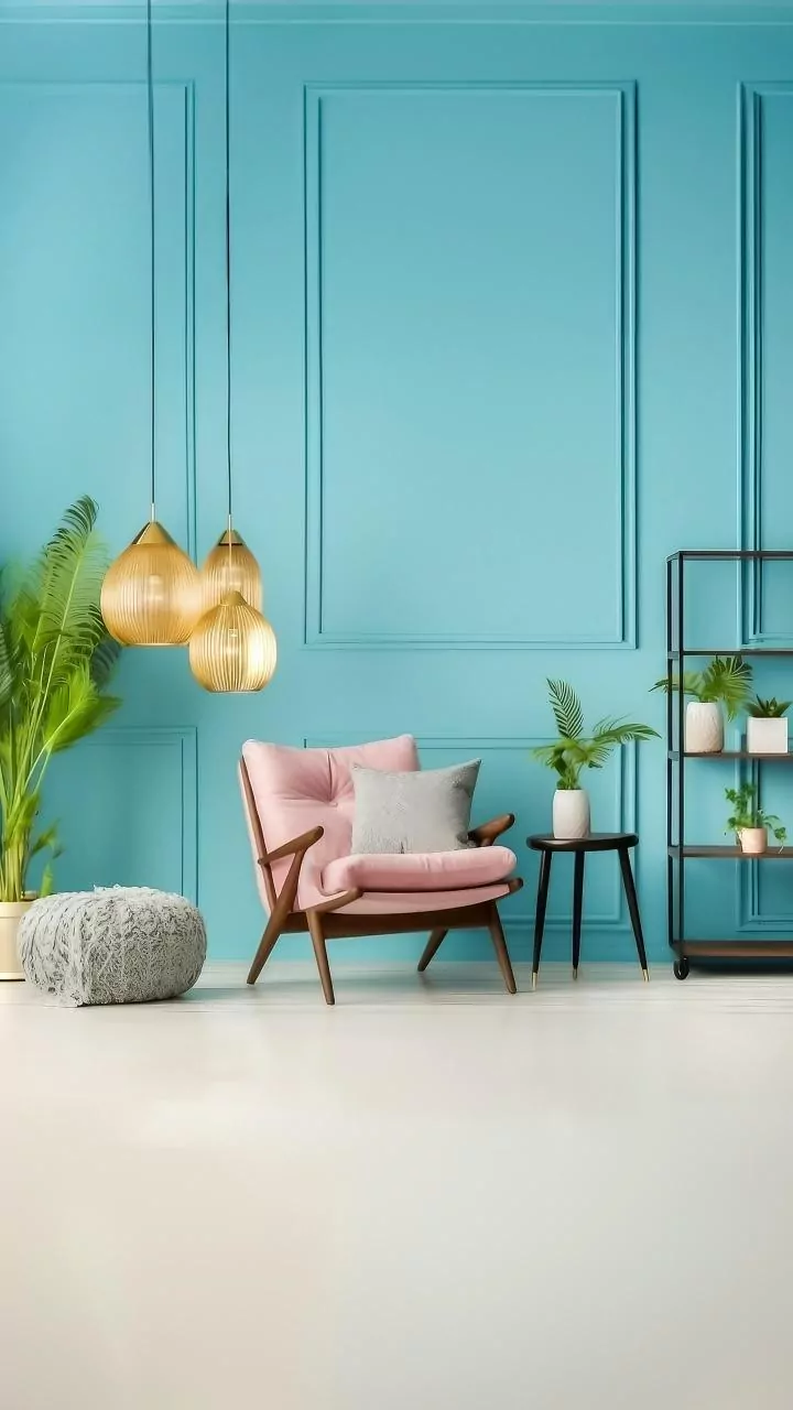
The key to successful colour-blocking lies in the colour combination. A great place to start is the colour wheel. Complementary colours—those directly opposite each other, like blue and orange or purple and yellow—create the most dynamic and high-energy contrast. For a slightly less intense but equally harmonious look, you could try a split-complementary scheme, which pairs one base colour with the two colours adjacent to its opposite. If you're nervous about going too bold, pair a vibrant shade with a calming neutral. Classic combinations like navy and white, or more contemporary pairings like emerald green and blush pink, are proven to work beautifully. A popular interior design guideline is the 60-30-10 rule: 60% of the space is a dominant colour, 30% is a secondary colour, and 10% is an accent. This can help create a balanced look.
Where to Apply for Maximum Impact
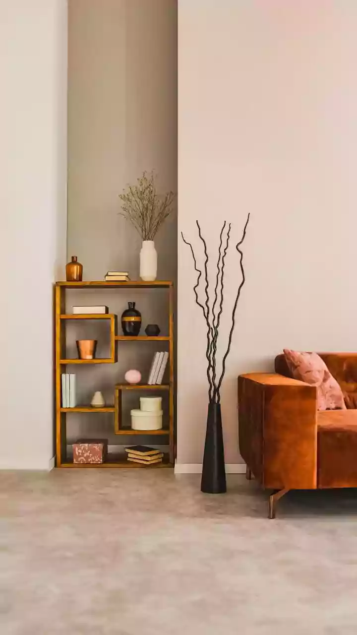
You don't need to cover an entire room to make a statement. Strategic placement is key. An accent wall behind a sofa or a bed is a classic choice, creating an immediate focal point. Colour-blocking can also be used to visually alter a room's proportions. Using vertical stripes or blocks can create the illusion of higher ceilings, while horizontal applications can make a room feel wider. Consider using wallpaper to highlight interesting architectural features, such as an alcove, a chimney breast, or the wall space around a doorway. A two-tone or half-wall application, with a darker colour on the bottom and a lighter one on top, can create a sense of spaciousness while keeping the room feeling grounded.
Tips for a Flawless Finish
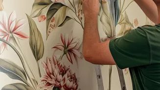
For a professional-looking result, preparation is everything. Ensure your wall is clean, dry, and smooth before you begin. Fill any cracks or holes and sand them down. If you've recently painted, it's best to wait at least three to four weeks for the paint to fully cure before applying any wallpaper, especially peel-and-stick varieties. When installing, it's often helpful to have a second person to assist, especially with larger panels. One person can guide the wallpaper at the top while the other holds the bottom to ensure proper alignment. Use a smoothing tool to press out air bubbles as you go, working from the centre outwards for a seamless finish. And don't worry about getting it perfect on the first try; most modern peel-and-stick wallpapers are repositionable.