The Power of a Colour Connection
Statement art does more than just fill a blank wall; it sets the emotional tone for your entire space. Whether it's a large, vibrant abstract canvas or a striking photograph, its job is to command attention. However, for a piece to feel truly integrated
and elevate a room, it needs to feel connected to its surroundings. This is where colour comes in. When the hues in your artwork are thoughtfully echoed in your decor—or vice versa—it creates a sense of harmony and intention. This doesn't mean everything has to match perfectly. Instead, think of it as a conversation between the art and the room, where colours are the shared language that ties everything together into one cohesive design story.
Using the 60-30-10 Rule with Art
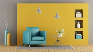
A classic interior design principle that works wonders here is the 60-30-10 rule. This guideline suggests a balanced colour palette is achieved by using a dominant colour for 60% of your space (usually walls and large furniture), a secondary colour for 30% (curtains, smaller furniture), and an accent colour for the final 10% (cushions, decor, and artwork). Statement art often fits perfectly into that 10% accent category. You can pull the most vibrant or eye-catching colour from your chosen painting and repeat it in small doses around the room. This creates a deliberate visual path for the eye, making the entire space feel polished and professionally styled without being rigid or predictable.
How to Pull a Palette from Your Art
If you've already fallen in love with a piece of art, let it be your guide for the room's entire colour scheme. Start by identifying the main colours within the artwork. Pick out three to four shades: a dominant hue, a secondary colour, and one or two accent tones. Use the dominant, often more muted, colour from the art for your walls. Then, bring in the secondary colour through larger items like a rug or an armchair. Finally, sprinkle the boldest accent colours from the artwork into smaller decorative items like vases, throw pillows, and lamps. This technique ensures your room is built around the art, making it the undeniable focal point and creating a rich, layered look that feels deeply personal and curated.
Complement, Don't Just Copy
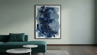
A common mistake is trying to find art that exactly matches the colours already in your room. This can cause the artwork to fade into the background, defeating its purpose as a 'statement' piece. A more sophisticated approach is to choose art with colours that complement your existing decor. Look at a colour wheel: shades that are opposite each other, like blue and orange, create a dynamic and exciting contrast. If your room has a neutral palette of greys or beiges, a piece with bold, warm colours can add energy and a focal point. The goal is harmony, not uniformity. The artwork should stand out while still feeling connected to the overall aesthetic of the space.
When the Art Comes First
Ideally, you should select your main piece of art before making major decisions about furniture or paint colours. This allows the artwork to serve as the foundation of your design, guiding all subsequent choices. When you start with the art, you're not trying to force a piece to fit into a pre-existing scheme. Instead, you're building a room that organically supports and enhances it. Consider the scale of the art in relation to your furniture; for instance, a piece hung above a sofa should generally be about two-thirds the width of the sofa to feel balanced. Letting the art lead the way turns decorating from a guessing game into a focused, creative process that results in a more cohesive and impactful space.