




Understanding Negative Space
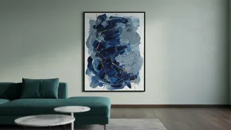
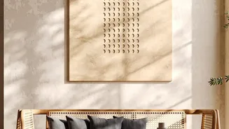
In interior design, the empty areas around and between objects are called “negative space.” It’s not just blank wall; it’s an active component of good design. For large artwork, negative space is what allows the piece to command attention without visually
shouting. It gives our eyes a place to rest, which helps bring the art into clear focus and creates a sense of harmony. Without sufficient breathing room, a powerful piece can feel cluttered and lose its impact, making the entire room seem smaller and more chaotic. The goal is to let the art be the hero, and that means clearing the area around it from competing decorations.
Mastering Scale and Proportion
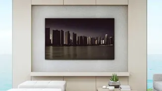
Choosing the right size art is less about the size of the piece itself and more about its relationship to the wall and furniture. A common mistake is selecting art that's too small, which can get lost on a large wall. As a general rule, artwork hung above a sofa, bed, or console table should span approximately two-thirds to three-quarters of the furniture's width. This creates a visual anchor and makes the art and furniture feel like a single, intentional arrangement. For tall walls, especially those with high ceilings, consider vertical artworks that draw the eye upward and balance the room's height. Don't be afraid to go big; designers often note that the piece that looks enormous in a store usually feels perfectly proportioned at home.
The Art of Placement
Where you hang your art is just as important as what you hang. The most common error is hanging art too high. The center of the artwork should typically be at eye level, which is around 57 to 60 inches (about 145-150 cm) from the floor. This connects the art to the human scale of the room. When placing art above furniture, leave about 6 to 10 inches (15-25 cm) of space between the bottom of the frame and the top of the furniture. This small gap ensures the pieces feel connected rather than disconnected and floating. Before you make any holes, test your placement by cutting paper to the size of your art and taping it to the wall to see how it feels.
Consider the Supporting Cast
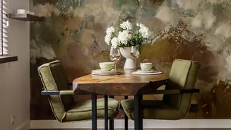
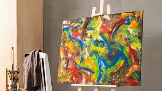
A large artwork doesn't exist in a vacuum. The surrounding elements, like lighting and furniture, play a crucial supporting role. Proper lighting can dramatically enhance an artwork’s colours and textures. Avoid placing art in direct, harsh sunlight, which can cause it to fade over time. Instead, consider track lighting or a dedicated picture light to make it a feature in the evening. The surrounding decor should complement, not compete. If you have a bold, colourful piece, keep the immediate area relatively simple. The idea is to create a clear focal point, and too much visual noise will dilute its power.
Secure Your Investment
Oversized artworks can be heavy, and using the right hardware is essential for safety and stability. Standard nails are often not sufficient for heavy pieces. Always use quality wall anchors, hooks, or mounting hardware rated for the artwork's weight and appropriate for your wall type (drywall, plaster, or brick). For particularly large or heavy frames, using two hooks or anchor points is recommended. This helps distribute the weight evenly, keeps the art level, and provides peace of mind that your investment is secure. If you're unsure, a local hardware store or professional framing service can offer guidance.