



From Numbers to Nebulae
The incredible images from telescopes like the James Webb or Hubble aren't photographs in the way we take pictures on our phones. When a telescope observes a galaxy billions of light-years away, it isn't capturing a colorful snapshot. Instead, it collects
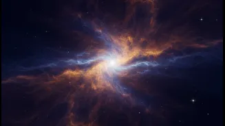
data as a stream of numbers. These numbers represent the brightness of light hitting the telescope's detectors. The raw data sent back to Earth is essentially a series of black-and-white images, each taken through a different filter that isolates a specific wavelength of light. Many of these wavelengths, like infrared or X-ray, are completely invisible to the human eye. This is where the magic begins, in a process that is both a scientific and creative endeavor undertaken by teams at places like NASA's Scientific Visualization Studio.
The Art of Choosing Colors
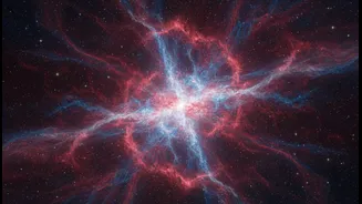
To make these invisible wonders visible, scientists and data visualizers act as translators. They assign visible colors—typically red, green, and blue—to the different black-and-white filtered images. The process is methodical and scientifically driven. Usually, the longest wavelengths of light are assigned to red, the shortest to blue, and the intermediate wavelengths to green, following the chromatic order of the visible spectrum. This is called representative color. It’s not about faking it; it’s a convention that helps scientists and the public interpret the data meaningfully. For example, in an image from the James Webb Space Telescope, the red hues might represent cooler, dustier regions, while blue could indicate hotter areas of star formation, revealing details that would otherwise be imperceptible.
More Than Just a Pretty Picture
While the results are undeniably beautiful, this process is crucial for scientific discovery. The deliberate color choices highlight different physical processes, chemical compositions, and structures within cosmic objects. An image that layers data from different telescopes—like combining X-ray data from Chandra, infrared from Webb, and visible light from Hubble—can reveal how these phenomena interact. This fusion of data allows astronomers to spot patterns and complexities they couldn't see in a single wavelength. The visualization process itself becomes a form of scientific inquiry, helping researchers to literally see their data in a new light and tell a more complete story about what’s happening in the universe.
Hearing the Universe's Song
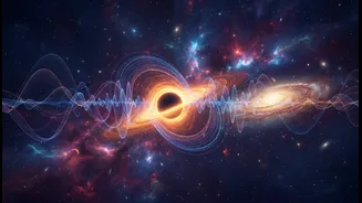
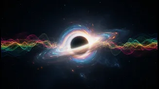
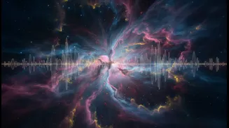
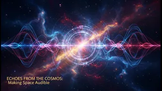
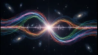
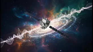
NASA's translation of data doesn't stop with images. In a process called sonification, scientists are turning astronomical data into sound. Projects led by the Chandra X-ray Center map data points from images to musical notes and sounds. For instance, the brightness of a light source might control the volume, while its position in an image could determine the pitch. The color data is also used, with different colors assigned to different notes or instruments. This technique makes space accessible in an entirely new way, particularly for the blind and visually impaired community. It has resulted in hauntingly beautiful compositions derived from supernova remnants, black holes, and entire galaxies, featured in documentaries like NASA's "Listen to the Universe."
Art as a Bridge to Science
Beyond deep space, NASA also uses data visualization to tell stories closer to home. The NASA Lifelines program commissions murals in cities that incorporate local satellite data. These murals, enhanced with augmented reality, might show changes in a local river or display a heat map of the area, making environmental data tangible and personal. This effort, along with the stunning cosmic images, is managed by dedicated teams of scientists, artists, and visualization experts. They are storytellers who bridge the gap between complex data and public understanding. Their work isn't just about presenting facts; it's about creating a connection and inspiring a sense of wonder about our planet and the cosmos.