

Understanding Scale and Proportion
In interior design, scale refers to how an object's size relates to the room itself, while proportion is about how different objects relate to each other. A large, dramatic painting might be perfectly scaled for a room with high ceilings, but if it's
hung over a small console table, its proportions will feel wrong. The goal is to create harmony. When the size of your statement piece works with the size of your furniture and the wall it occupies, the entire room feels more balanced and cohesive. This prevents the common mistake of choosing decor that is either too small and gets lost, or too large and overwhelms the space.
The Two-Thirds Rule for Furniture
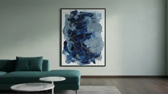
One of the most trusted guidelines in interior design is the two-thirds rule. When hanging artwork above a piece of furniture like a sofa, bed, or console table, the art should be about two-thirds to three-quarters the width of the furniture below it. For example, if your sofa is 90 inches wide, your artwork should be in the range of 60 to 68 inches wide. This principle ensures the art feels anchored and visually connected to the furniture, creating a unified vignette rather than appearing to float awkwardly on the wall. If you have one smaller piece you love, consider grouping it with others to create a gallery wall that collectively follows the two-thirds rule.
Mastering the Art of Placement
Proportion isn't just about width; it's also about height. A common mistake is hanging art too high. When placing a piece above furniture, the bottom of the frame should be about 4 to 8 inches above the top of the item. Some designers extend this up to 12 inches, but the key is to keep the gap small enough that the two pieces feel like a single unit. If you're hanging art on a blank wall without furniture beneath it, the rule changes. Here, the centre of the artwork should be at average eye level, which is typically 57 to 60 inches from the floor. This is the standard used by galleries to create a comfortable viewing experience.
Sizing for Large, Empty Walls
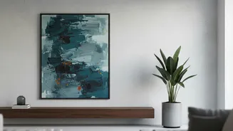
A vast, empty wall can be intimidating, but it's also a fantastic opportunity for a true statement piece. For tall or wide walls, a general guideline is to choose artwork that is at least 48 inches on its longest side. A smaller piece will look visually lost. Another approach is the 60-75% rule: your art should fill roughly 60% to 75% of the available wall space. Don't be afraid to go big. An oversized canvas or a multi-panel set can anchor the entire room, balance high ceilings, and turn an otherwise plain wall into a dramatic focal point that feels curated and intentional.
Beyond the Canvas: Mirrors and More
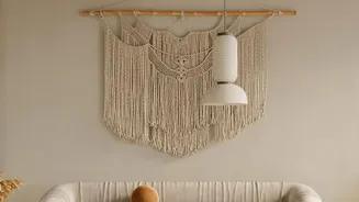
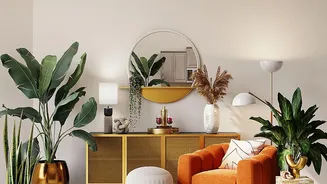
These principles of proportion don't just apply to paintings and prints. The same rules are essential when placing other large decorative items, such as statement mirrors, sculptural wall hangings, or even significant lighting fixtures. A large mirror over a console table, for instance, should still follow the two-thirds width rule to feel balanced. Similarly, a collection of smaller items, like woven baskets or ceramic plates, should be grouped together to function as a single, large statement piece that respects the proportions of the space. Remember that even negative space—the empty wall around your piece—is a crucial element. Giving your statement item breathing room helps it stand out and prevents the room from feeling cluttered.