








Decoding the Air Quality Alphabet
The most common term you'll hear is the Air Quality Index, or AQI. Think of it as a scoreboard for air pollution that runs from 0 to 500. The lower the number, the cleaner the air. India's AQI system uses six colour-coded categories: Good (Green), Satisfactory
(Light Green), Moderately Polluted (Yellow), Poor (Orange), Very Poor (Red), and Severe (Maroon). The final AQI number you see is determined by the pollutant with the highest concentration at that moment. So, if Particulate Matter is dangerously high but other pollutants are low, the AQI will still reflect that severe risk. The main pollutants tracked are Particulate Matter (PM2.5 and PM10), Nitrogen Dioxide (NO2), Sulphur Dioxide (SO2), Carbon Monoxide (CO), Ozone (O3), Ammonia (NH3), and Lead (Pb).
PM2.5: The Invisible Threat
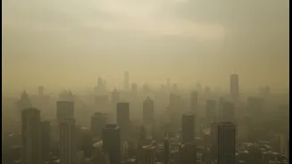
You will often see special attention given to PM2.5. These are tiny pollutant particles less than 2.5 micrometres wide—about 30 times smaller than a human hair. While larger PM10 particles from dust and construction often get trapped in our nose and throat, PM2.5 particles are far more dangerous. They are so fine they can penetrate deep into our lungs and even enter the bloodstream, increasing the risk for respiratory and cardiovascular diseases. Across Indian cities, PM2.5 is very often the primary driver when the AQI level jumps into the 'Poor' or 'Severe' categories. Its main sources are combustion-related: vehicle emissions, industrial smoke, power plants, and the burning of crops and waste.
Your Personal Air Quality Toolkit
Knowledge is power, and luckily, it's right at your fingertips. Several reliable apps and websites can give you real-time air quality data for your specific location. For official government data, the 'Sameer' app from the Central Pollution Control Board (CPCB) is the gold standard. It provides hourly AQI updates from monitoring stations across the country. Other highly-rated international apps like 'IQAir AirVisual' and 'Plume Labs' offer detailed forecasts, pollutant breakdowns, and even street-by-street maps by combining official data with satellite information and AI. Simply searching "air quality near me" on Google can also give you a quick snapshot. Using these tools helps you make informed decisions, like whether it's a good day for a run or if you should keep your windows closed.
From Data to Dialogue: Telling the Story of Air
For storytellers, the goal is to make the numbers feel personal. Data alone can be abstract, but stories create connection and inspire action. Instead of just stating the AQI is 350, talk about what that means for people. Connect the data to lived experiences. Tell the story of a street vendor whose health suffers on high-pollution days, or how a child's asthma gets worse during winter smog. Use the data from your AQI app to add credibility to these human stories. For example, you can correlate a spike in PM2.5 with a local festival's firecrackers or a nearby construction project. Responsible storytelling focuses on these real-world impacts, moving the conversation from abstract statistics to relatable human consequences that demand attention.
Good Isn't Always Good Enough
It's also important to understand the context behind the numbers. India's National Ambient Air Quality Standards (NAAQS) define the permissible limits for pollutants. For example, the 24-hour standard for PM2.5 is 60 µg/m³. However, the World Health Organization (WHO) recommends a much stricter guideline of just 15 µg/m³ for the same period. This means that even when the air is officially rated as 'Satisfactory' or 'Moderate' by Indian standards, it might still be considered unhealthy by global health benchmarks. Chronic exposure to even moderate levels of pollution can have long-term health effects. Understanding this gap is crucial for advocating for stronger policies and truly clean air, not just air that meets a lenient standard.