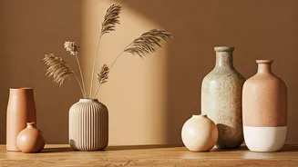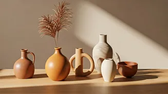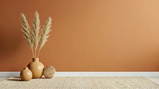


Defining the Clay Palette
So, what exactly are 'clay shades'? Think of colours pulled directly from the earth. This versatile palette includes warm, muted tones reminiscent of sun-baked terracotta, dusty rose, rich sienna, golden ochre, and even soft, brownish blush. These aren't
bright, attention-grabbing hues. Instead, they are subdued, sophisticated, and deeply rooted in the natural world. From the reddish-brown of a clay pot to the pale beige of dry earth, these colours share a common DNA: they feel organic, timeless, and inherently authentic. This connection to natural pigments is what gives them their unique power to make a space feel instantly more inviting and human.
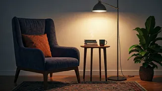
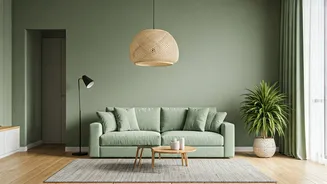
The Psychology of Cosiness
There's a reason these colours feel so comforting. Psychologically, warm, earthy tones are associated with stability, security, and nature. Unlike cool blues or sterile whites that can sometimes feel distant, clay shades wrap a room in a gentle embrace. They evoke a feeling of being grounded—literally, connected to the ground beneath our feet. This primal connection helps to quiet the mind and create a restful atmosphere. In interior design, these hues are known to advance, meaning they make a space feel more intimate and enclosed in a positive, cosy way. They absorb light rather than reflecting it harshly, contributing to a softer, more tranquil environment perfect for unwinding.
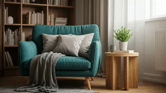
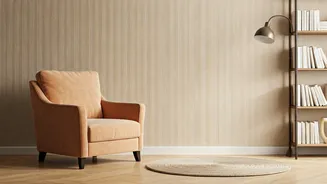
Start Small with Earthy Accents
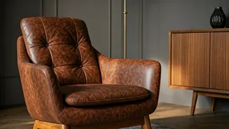
Adopting a new colour palette doesn't require a complete overhaul. One of the easiest ways to introduce clay shades is through accents and textiles. Look for terracotta-coloured planters for your houseplants, which add a touch of handcrafted charm. Swap out your existing cushions for new ones in a mix of rust, ochre, and blush tones. A chunky-knit throw blanket in a warm sienna, draped over a sofa or bed, can instantly boost the cosiness factor. Even small decorative objects like vases, candles, or artwork featuring these earthy hues can have a significant impact, layering warmth and texture into your existing decor without a major commitment.
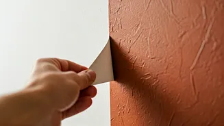
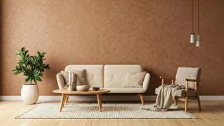
Make a Bolder Statement
Ready to dive in deeper? Clay shades are stunning when used on a larger scale. A feature wall painted in a deep, matte terracotta can become a dramatic and sophisticated focal point in a living room or bedroom. It creates a rich backdrop that makes furniture and art pop. For a more subtle but equally impactful approach, consider painting a piece of furniture, like a bookshelf or a console table, in a muted clay pink or earthy red. Large area rugs in these tones are another excellent way to define a space and anchor a seating area, infusing the entire room with warmth from the ground up.
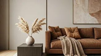
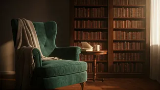
Perfect Colour Pairings
Clay shades are surprisingly versatile and pair beautifully with a wide range of other colours and materials. For a serene, minimalist look, combine them with creamy whites, soft beiges, and light grey. This allows the warmth of the clay tones to stand out without overwhelming the space. They also work wonderfully with natural materials; think light-toned wood, rattan, jute, and linen, which enhance their organic feel. If you crave more contrast, pair rich terracotta or sienna with deep forest greens or navy blues. The coolness of the blue or green provides a stunning balance to the warmth of the clay, creating a dynamic and well-rounded colour scheme that feels both bold and harmonious.