

Start by Curating Your Collection
The best gallery walls feel collected over time, even if assembled more quickly. Before you think about frames, focus on the art itself. A vintage aesthetic is defined by warmth, history, and personality. Look for pieces at thrift stores, estate sales,
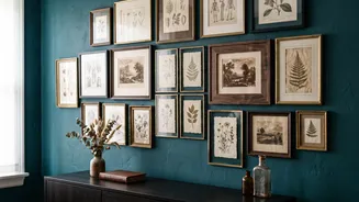
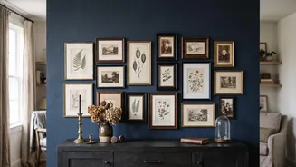
and flea markets. Don't overlook items with beautiful frames but uninspiring art—the art can always be replaced. Blend personal photos, like black-and-white or sepia-toned family portraits, with vintage finds such as botanical prints, old posters, landscapes, or architectural sketches. You can also include other objects like small mirrors, woven trays, or decorative plates to add texture and depth. The goal is to gather a collection that tells your unique story.
The Art of Mixing Frames
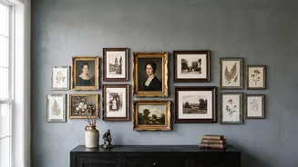
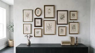
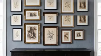
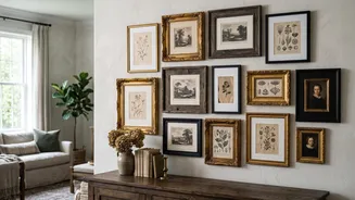
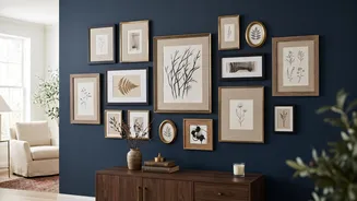
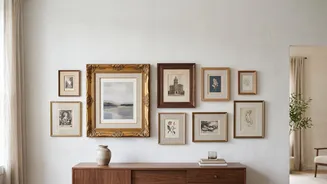
Mixing ornate and simple frames is what gives a vintage gallery wall its eclectic charm, but the key is to make it look intentional, not random. To create harmony, find a unifying element. A great approach is to limit your frame finishes to two or three, like antique gold, dark wood, and simple black. Let one finish dominate, use a second for balance, and the third as a small accent. This repetition helps the collection feel cohesive. Another strategy is to use the same color mat, like a consistent off-white or cream, for several pieces, which can tie different frame styles together. The contrast between a detailed, Rococo-style gold frame and a clean, modern black one creates visual energy, but the shared elements ensure they feel like part of the same family.
Plan Your Layout Before Nailing
One of the biggest mistakes is hanging pieces without a plan. To avoid unnecessary nail holes, lay your entire arrangement on the floor first. Trace each frame onto kraft paper or newspaper, cut out the templates, and tape them to the wall. This allows you to experiment with placement and balance. Start with your largest or most compelling piece, known as the anchor. Place it at the visual center of the arrangement—or slightly off-center for a more organic feel—and build outwards. Aim to keep spacing consistent, typically between 2 to 4 inches, to give each piece breathing room while maintaining a unified look. The entire grouping should be centered at eye level, which is roughly 57-60 inches from the floor.
Achieve Balance, Not Perfect Symmetry
While a rigid grid layout has its place in modern design, a vintage gallery wall thrives on a more relaxed, asymmetrical arrangement. This 'salon style' approach feels more collected and less staged. The goal is visual balance rather than perfect symmetry. For instance, one large, heavy frame can be balanced by a cluster of two or three smaller frames on the opposite side. Mix vertical and horizontal orientations to create rhythm and movement. This intentional imperfection is what gives the wall its character, suggesting that the collection has grown and evolved over time. Don't be afraid to leave some negative space; it gives the eye a place to rest and prevents the wall from feeling cluttered.