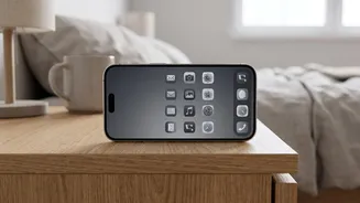







The Science of ‘Boring’
App developers and user experience designers are masters of color psychology. They use bright, vibrant colors strategically to make their platforms engaging and, frankly, addictive. Think of the bright red notification badges that create a sense of urgency,
or the candy-colored icons that practically beg to be tapped. These colors are not accidental; they are chosen to trigger a release of dopamine, the brain's 'feel-good' chemical, which creates a reward loop that keeps you coming back for more. It’s a system former Google design ethicist Tristan Harris has compared to a slot machine. By switching your phone to grayscale, you effectively strip away these carefully engineered visual rewards. The once-exciting app icons and notifications become muted and uniform. This makes the entire experience less stimulating and, in a way, 'boring', which is exactly the point.
Your Brain on Grayscale
When the colors disappear, the dopamine hits do, too. An endless Instagram feed is suddenly less captivating when the vibrant photos are reduced to shades of gray. The urgent red dot on your email app loses its power to provoke anxiety. According to neuroscientists, this change short-circuits the addictive cycle. Instead of your brain anticipating a reward every time you unlock your phone, the experience becomes neutral. Studies have shown this simple switch can have a measurable impact. Some research indicates that users who enable grayscale mode can reduce their daily screen time by 20 to 40 minutes. It primarily cuts down on the time spent in apps, like social media and web browsers, rather than the number of times you pick up your phone out of habit.
How to Enable Grayscale on an iPhone
Making the switch is simple and completely reversible. On an iPhone, navigate to 'Settings', then tap 'Accessibility'. From there, select 'Display & Text Size', and then 'Color Filters'. Toggle 'Color Filters' on and choose 'Grayscale' from the list. For even more convenience, you can create a shortcut. In the 'Accessibility' menu, scroll to the bottom and tap 'Accessibility Shortcut'. Select 'Color Filters'. Now, you can triple-click the side button (or home button on older models) to easily toggle grayscale mode on and off whenever you need to see colors for a specific task.
How to Enable Grayscale on Android
The path to grayscale on Android devices can vary slightly depending on the manufacturer, but it's generally found in the accessibility settings. For most Android phones, including Google Pixel and Motorola, go to 'Settings', then 'Accessibility'. Look for 'Color and motion' and select 'Color correction'. Turn on 'Use color correction' and choose 'Grayscale'. On Samsung devices, the path is typically 'Settings' > 'Accessibility' > 'Visibility enhancements' > 'Color adjustment', where you can then select 'Grayscale'. Many Android phones also allow you to set an accessibility shortcut to quickly turn the feature on or off. Some, like the Google Pixel, even let you schedule grayscale mode to turn on automatically at bedtime via the 'Digital Wellbeing' settings.
What to Expect From the Change
When you first switch to grayscale, your phone will feel strange, even a little dull. You might realize how much you relied on color to navigate your apps. It's important to see this not as a punishment, but as a tool for mindfulness. The goal isn't to make your phone unusable, but to make you more intentional about when and why you use it. You may find you're less likely to get lost in a social media rabbit hole and more likely to use your phone as a simple communication tool. It’s a low-effort experiment that can help you build a healthier relationship with your device without the drastic step of deleting apps altogether.