

The Philosophy of the Mix
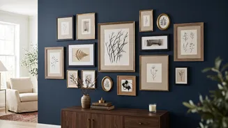
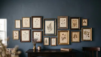
The secret to a high-impact gallery wall isn't perfect matching, but intentional contrast. Combining elaborate, decorative frames with clean, minimalist ones creates a dynamic visual tension that draws the eye. An ornate gold frame might be the statement
piece, while simpler black or wood frames provide a calm, grounding presence. The goal is to make the collection feel curated, not chaotic. This balance between varied styles is what separates a haphazard arrangement from a professional-looking display that feels both personal and layered. Think of it as a conversation between the pieces, where different styles relate to and complement one another.
The Thrill of the Hunt
Building your collection is part of the charm. Thrift stores, antique shops, and flea markets are treasure troves for unique, affordable frames with character. Look for pieces with interesting details like carved wood or a gently aged patina. Don't worry if the finish isn't perfect or if a frame lacks glass; a can of spray paint can unify mismatched finds, and new glass is an easy fix. Supplement your vintage finds with new frames from decor or craft stores. Simple, modern frames in black, white, or natural wood are versatile and provide a clean counterpoint to your more decorative pieces. When thrifting, buy a few more frames than you think you need to have options when you start arranging.
Find a Unifying Element
To prevent your eclectic mix from looking messy, you need a common thread to tie everything together. This unifying element can take several forms. One popular strategy is to limit your frame colours to a palette of two or three. For example, you could use mostly black and wood frames with one or two gold frames as accents. Another approach is to use a consistent colour for all your photo mats, such as a crisp white or warm cream, which creates harmony even when the frames themselves are wildly different. You can also unify the display through the content itself, such as using all black-and-white photos, sepia tones, or artwork with a shared theme like botanical prints or travel posters.
Plan Your Layout on the Floor
Before a single nail goes into the wall, map out your arrangement on the floor. This is the most crucial step to achieving a balanced look. Start by placing your largest or most significant piece, known as the anchor, slightly off-centre. Then, build outwards with your other frames, experimenting with placement. A good rule is to maintain consistent spacing between each frame—typically two to three inches—to give the art room to breathe while still feeling like a single, cohesive unit. Mix vertical and horizontal orientations to create rhythm and movement. Once you have a layout you love, take a photo from above to reference as you begin hanging.
More Than Just Art
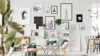
A truly dynamic gallery wall often incorporates more than just framed prints. Mixing in three-dimensional objects adds texture and breaks up the flatness of a wall of frames. Consider including a small, interesting mirror, a piece of woven textile, a vintage postcard, or even a small sculptural item. These elements add personality and a sense of history. The key is moderation; use these decorative accents sparingly to act as surprising points of interest rather than overwhelming the artwork. Pairing a flat print next to a dimensional object like a small convex mirror can create a beautiful contrast.
Hanging With Confidence
With your layout planned and photographed, it's time to transfer it to the wall. A popular method involves tracing each frame onto craft paper, cutting out the shapes, and taping them to the wall with painter's tape. This allows you to visualize the final placement and make adjustments without creating unnecessary holes. As a general guideline, the centre of the entire arrangement should be at eye level, around 57 to 60 inches from the floor. If the gallery wall is above a piece of furniture like a sofa or console table, the bottom of the lowest frame should be about 6 to 8 inches above it.