



More Than Just a Pretty Picture
When we see a stunning image from the James Webb or Hubble space telescopes, a common question arises: are those colours real? The answer is complex. Telescopes like these are scientific instruments, not consumer cameras. Their primary goal is to capture
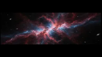
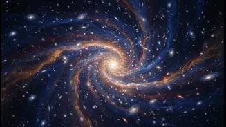
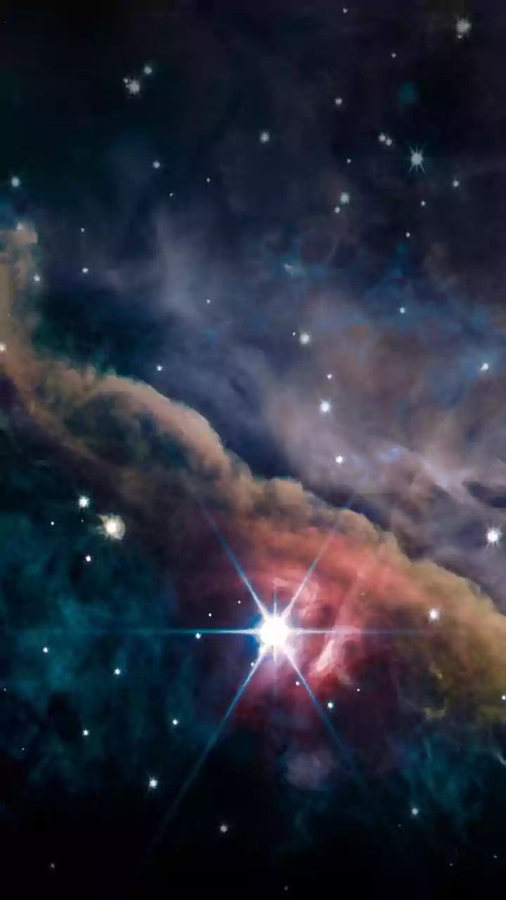
light, which arrives as black-and-white data. The images are initially monochrome, simply showing the intensity of light collected. The colours are added later in a process that is both a science and an art. This technique, often called "false-colour" or "representative-colour" imaging, isn't meant to deceive. Instead, it makes vast amounts of scientific information understandable and highlights details that would otherwise be lost.
Seeing the Invisible Universe
A major reason for using representative colour is that telescopes can detect light far beyond the visible spectrum that human eyes can perceive. Observatories like the James Webb Space Telescope are designed to see in infrared, while others can detect ultraviolet or X-rays. Since we can't see these wavelengths, scientists assign visible colours to them to make the data accessible. Typically, they follow a chromatic order: the shortest wavelengths are assigned to blue, medium wavelengths to green, and the longest to red. This allows us to perceive information about temperature, distance, and composition that is encoded in non-visible light, effectively translating an invisible universe into a language our eyes can comprehend.
A Palette of Chemical Elements
One of the most powerful uses of colour is to map the chemical makeup of cosmic objects. Astronomers use special narrowband filters that isolate the light emitted by specific elements. For example, in many iconic images of nebulae, colours are assigned to show the distribution of different gases. A famous example is the "Hubble Palette," where light from sulfur is assigned red, hydrogen is assigned green, and oxygen is assigned blue. While hydrogen and sulfur emissions both appear reddish to the eye, assigning one to green creates a much more detailed and scientifically useful image. This reveals the intricate structure of how these gases interact, which would be lost in a sea of red if only "natural" colours were used.
The Blend of Science and Art
Creating these final images is a collaborative process involving scientists and image processing specialists. Their goal is to produce an image that is both scientifically accurate and aesthetically engaging. The process begins with raw, often almost black, data which is then 'stretched' to reveal details hidden in the dark regions. After assigning colours based on wavelength or chemical element, specialists carefully balance and fine-tune the image. This might involve adjusting brightness and contrast or rotating the image to draw the viewer's eye to the most significant features. There is no 'up' in space, so the orientation itself is an editorial choice made to create a balanced and compelling composition.