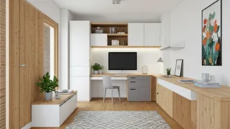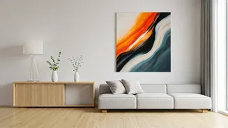


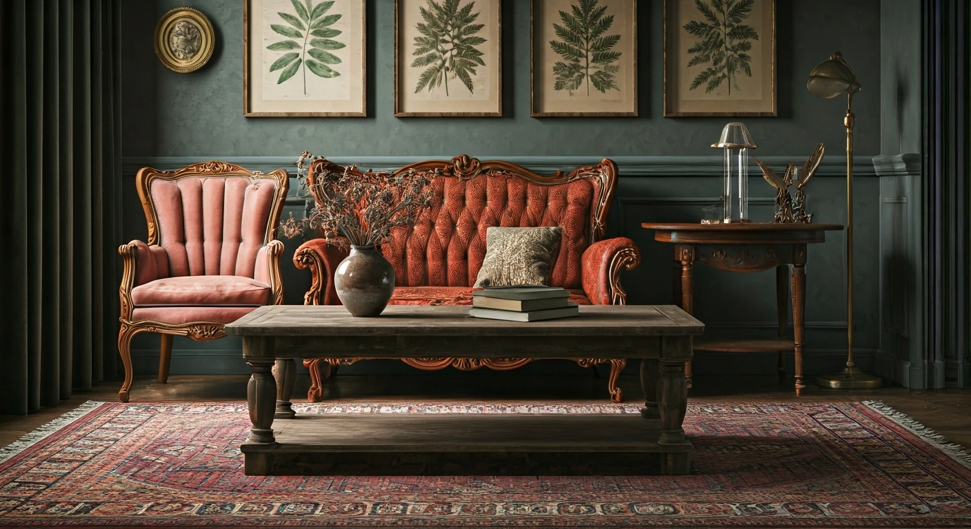


Why Bigger Is Better
It feels counterintuitive, but designers agree that a single, large piece of art can do more for a small room than a dozen smaller items. The logic is simple: multiple small frames create visual clutter, forcing your eye to jump from one point to the
next and highlighting the limited wall space. A single, large statement piece, however, provides one clear focal point. This confident anchor draws attention, making the room feel more organised and visually simplified. Instead of a collection of whispers, you get one clear, powerful statement that makes the entire room feel purposeful. It’s a design trick that signals confidence and transforms a potentially cramped space into a curated gallery-like environment.
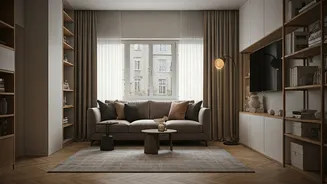
The Illusion of Space and Depth
Beyond creating a focal point, a large artwork can cleverly manipulate the perception of space. A vertical, portrait-oriented piece can draw the eye upward, creating the illusion of higher ceilings. A horizontal, landscape-style work can make a narrow room feel wider. Art that depicts landscapes or has a strong sense of perspective can add visual depth, making the wall seem to recede. Even the colour palette plays a role. Cool tones like soft blues and greens tend to visually pull back, making a wall feel further away than it is. The artwork essentially becomes a window, tricking the eye into seeing an expanded horizon and making the room feel more open and airy.
How to Choose the Right Piece
Choosing a large piece of art doesn’t have to be intimidating. A trusted rule of thumb from interior designers is the two-thirds rule: the artwork should be about two-thirds the width of the furniture it hangs above, like a sofa or headboard. This ensures the art feels connected to the furniture, creating a harmonious balance. Hang it so there are about 6-12 inches between the bottom of the frame and the top of the furniture to avoid a disconnected, floating look. When it comes to style, choose something that reflects your personality. It could be an abstract canvas with a simple colour palette, a large-format photograph, or even a framed textile. The goal is to find a piece you love that complements the room’s existing mood and colours.
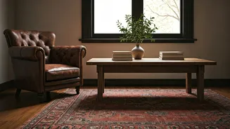
Common Mistakes to Avoid
The most common mistake when hanging any art is placing it too high. The centre of the artwork should be at eye level, which is typically around 57-60 inches from the floor. This makes the art feel integrated into the room rather than awkwardly disconnected. Another pitfall is not giving the piece enough breathing room. Overcrowding a wall can create visual chaos, so let your statement piece be the hero by keeping the surrounding wall relatively clear. Finally, consider the frame. In a small space, a heavy, ornate frame can feel bulky. A simple, thin frame or a gallery-wrapped canvas often works better, keeping the focus on the art itself and maintaining a lighter feel.