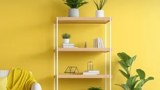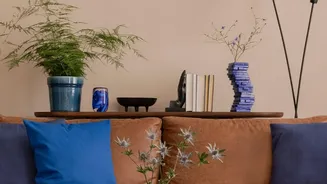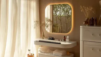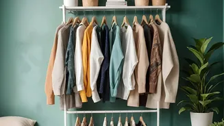

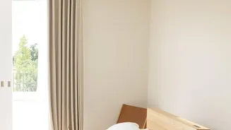
The Great Beige Burnout
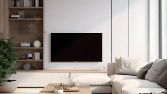
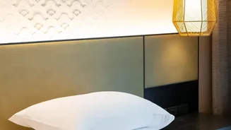
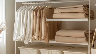
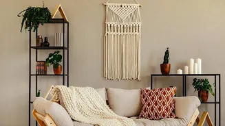
Let’s be honest: there is nothing inherently wrong with beige. It’s a warm, versatile neutral that can create a calming atmosphere. The issue arose when this single shade, along with its cousin greige, staged a total takeover. Spurred by minimalist and
'quiet luxury' trends, entire homes were drenched in a sea of beige, from walls and sofas to rugs and bedding. While initially chic, this monochromatic approach often resulted in spaces feeling flat, one-dimensional, and frankly, a bit boring. Designers and homeowners are now pushing back, seeking to inject personality, depth, and joy back into their living spaces. It's less about a war on beige and more about a renaissance of personal expression.
What Is a Balanced Palette?
The retreat from beige isn't about descending into colour chaos. The key is balance. This is where designers employ simple, time-tested formulas to ensure a room feels harmonious and intentional rather than haphazard. The most famous of these is the 60-30-10 rule. This principle suggests a simple distribution of colour: 60% of your room should be a dominant colour, 30% a secondary colour, and 10% an accent colour. This creates a clear hierarchy that is pleasing to the eye and easy to follow. The goal is to create a cohesive look where colours work together to build a layered, interesting environment.
The 60-30-10 Rule in Practice
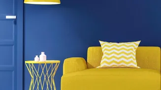
Think of it this way: The 60% is your main backdrop, often covering the largest surfaces like walls or a large sofa. This sets the overall mood. The 30% is your secondary player, providing contrast and interest. This might show up in curtains, accent chairs, or a feature rug. The final 10% is where you get to have fun. This is your accent colour, used sparingly in small doses like throw pillows, artwork, or decorative objects to add a pop of personality. This structure provides a safety net, giving you the confidence to move beyond a single neutral and play with more complex and exciting combinations.
The Psychology of Colour
This shift is also rooted in our emotional connection to our surroundings. Colour psychology is a key element of interior design, influencing our mood and the overall feel of a space. After a period of global uncertainty, many people are looking to cultivate feelings of joy, energy, and comfort within their homes. Colours like muted greens and blues are known for their calming, nature-inspired feel. Warmer tones like terracotta, dusky pinks, and butter yellows can make a space feel more uplifting and welcoming than a stark neutral might. By thoughtfully incorporating these hues, we're not just decorating; we're creating an atmosphere that actively supports our well-being.
How to Find Your Palette
Moving away from an all-beige scheme can feel daunting, but you don’t need to be a professional designer to succeed. Start by finding a source of inspiration. It could be a piece of art you love, a vibrant rug, or even a favourite item of clothing. Pull three to four colours from that source to begin building your palette. Remember, you don't have to abandon neutrals entirely. In fact, a sophisticated neutral can still serve as your 60% dominant shade, while you introduce more adventurous secondary and accent colours. The new trend isn't about banishing beige, but rather about using it as a component within a richer, more dynamic and layered story.