


The Big Picture From Above
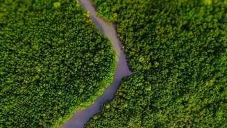
The first step in understanding the scale of mangrove loss is to get a bird's-eye view. Ecologists use powerful remote sensing technology, primarily through satellite imagery. Data from satellites like the Indian Remote Sensing (IRS) series, the European
Space Agency's Sentinel, and NASA's Landsat are invaluable. These satellites regularly capture high-resolution images of the earth's surface, allowing scientists to conduct time-series analyses. By comparing images of Kerala's coastline from today with those from five, ten, or twenty years ago, they can visually and quantitatively measure the change in mangrove cover. Specific indices, like the Combined Mangrove Recognition Index (CMRI), are derived from this data to enhance the accuracy of identifying mangrove areas versus other types of vegetation or water bodies.
Layering the Data with GIS
Once satellite data is collected, it’s fed into a Geographic Information System (GIS). Think of GIS as a set of digital transparencies stacked on a map. Each layer contains different information: one layer shows the mangrove cover from 2024, another from 2014, and another from 2004. Scientists can add more layers, such as maps of urban development, locations of aquaculture farms, river networks, and pollution sources. By overlaying these data sets, ecologists can identify 'hotspots' of degradation and correlate them with specific man-made or natural pressures. This technique moves beyond simply asking 'how much' mangrove area has been lost and begins to answer 'why' and 'where' it is happening most intensely.
Boots on the Ground
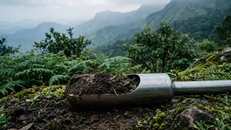
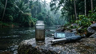
Technology alone doesn't tell the whole story. The data from satellites and GIS models must be verified on the ground, a process known as 'ground-truthing'. Ecologists and forest department officials travel to the specific locations identified in their maps. There, they conduct detailed surveys, measuring tree density, canopy height, and species diversity. They take soil samples to check for salinity and pollutants, and water samples to assess quality. This fieldwork is crucial for confirming that what the satellite sees as a 'loss of green cover' is indeed degraded mangrove forest and not something else. It also helps in identifying nuanced threats that are invisible from space, such as the spread of invasive plant species that choke out native mangroves.
Uncovering the 'Why' of the Decline
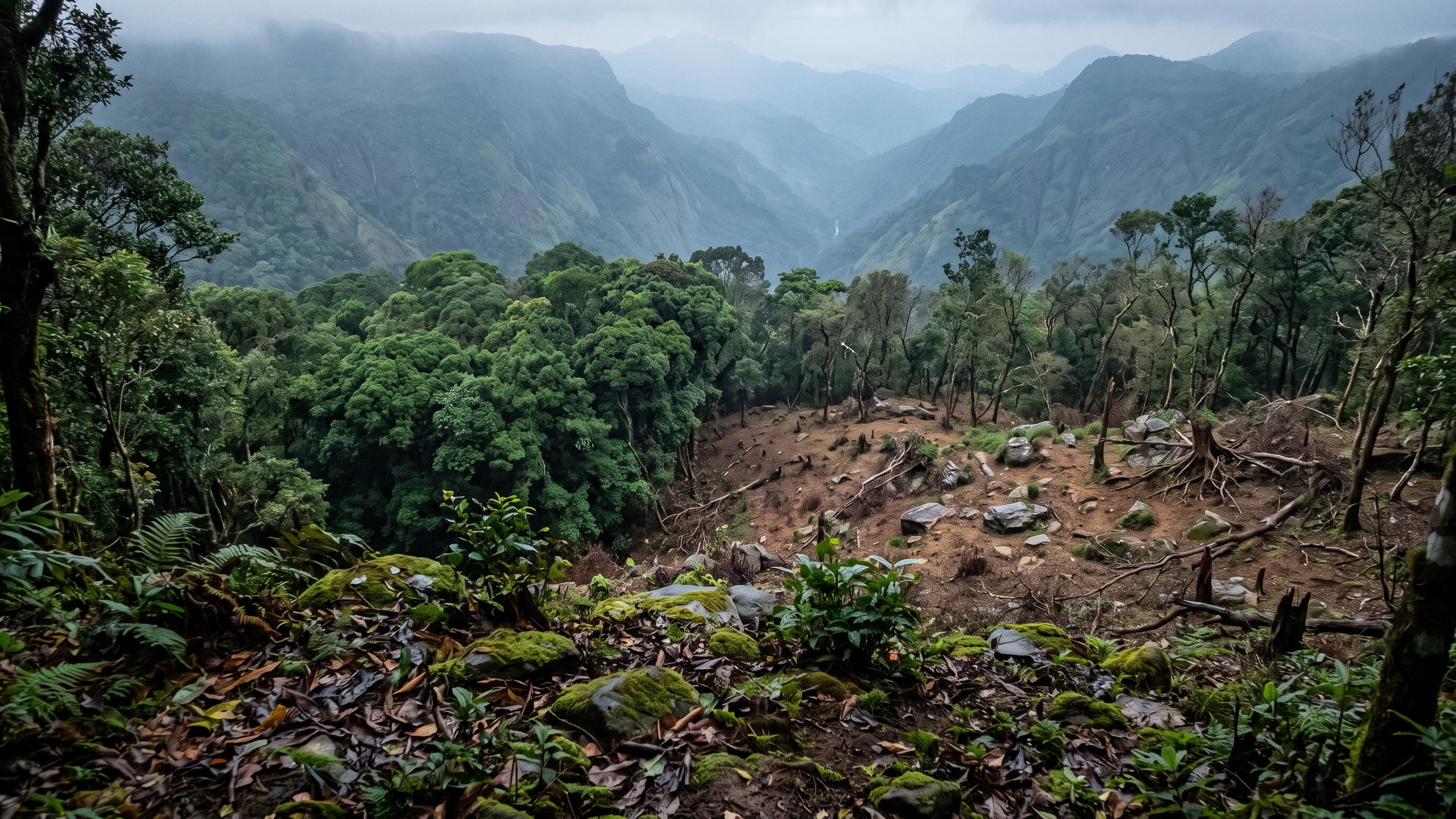
This combination of high-tech mapping and on-the-ground investigation has revealed the primary drivers of mangrove loss across Kerala. Studies have pointed to a staggering reduction in mangrove cover over the past few decades. The main culprits identified through this mapping are anthropogenic pressures: the conversion of mangrove areas for aquaculture (especially shrimp farming), urban expansion and infrastructure development, pollution from industrial and solid waste, and the reclamation of land for agriculture, such as coconut plantations. In many areas, the fact that over 75% of mangrove patches are under private ownership makes conservation and regulation incredibly challenging.
From Maps to Action Plans
The ultimate goal of mapping degradation is not just to document it, but to reverse it. These detailed maps serve as critical tools for policymakers and conservation organisations. They allow for the creation of targeted and site-specific restoration programs. For example, if a map shows a particular patch of mangroves is degrading due to pollution from a nearby town, the solution will be different than for an area threatened by rising salinity. Organisations like the Wildlife Trust of India use this information for projects like the Kannur Kandal Project, which focuses on acquiring privately-owned mangrove patches and undertaking community-led restoration efforts. The data also helps authorities enforce environmental laws, such as the Kerala Preservation of Trees Act, by providing clear evidence of illegal deforestation.