
The Psychology of a Timeless Palette
There is a reason interior designers consistently return to neutral colours: they are psychologically grounding. Hues like beige, taupe, soft grey, and warm whites create a sense of calm and order, allowing the mind to relax without being overstimulated.
Unlike a jolt of neon, which is designed to grab attention, neutrals provide a serene backdrop that makes a space feel more open, brighter, and larger by reflecting more light. This creates an emotionally quiet canvas that supports, rather than competes with, your furniture, art, and life. A neutral base is inherently versatile, adapting to changing styles—from minimalist to traditional—and allowing statement pieces to shine without visual conflict.
Understanding Colour-Blocking as a Technique
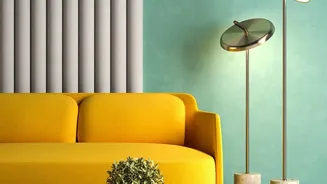
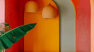
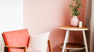
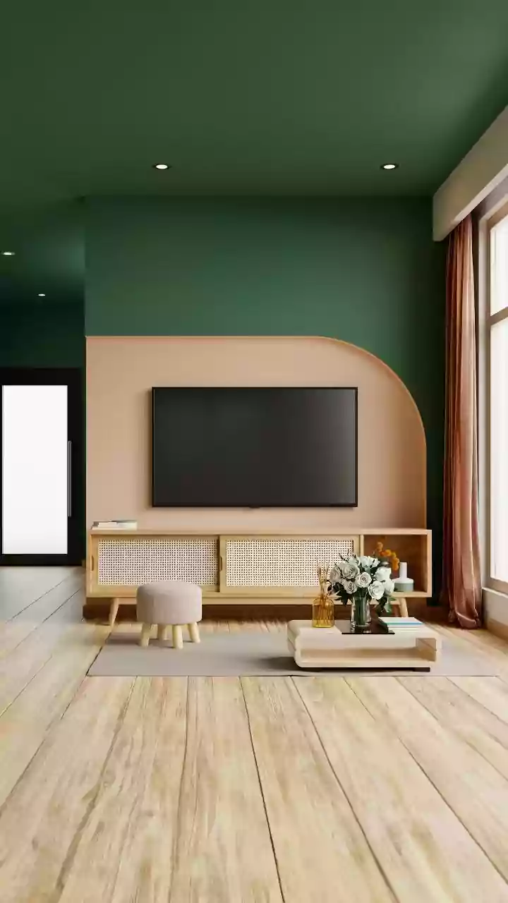
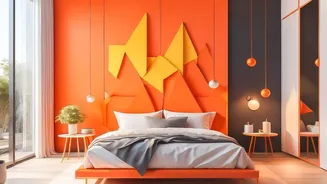
Colour-blocking is not just about using multiple colours; it's a design technique that uses distinct, geometric blocks of colour to define spaces, create focal points, and add architectural interest. While often associated with bold, high-contrast pairings, its true strength lies in its versatility. You can achieve a sophisticated effect by using different tones of the same neutral family—a concept known as a monochromatic palette. Imagine pairing a whispery taupe with a deeper mushroom grey, or an off-white with a creamy beige. This approach adds depth and structure without overwhelming the senses, giving a room a custom, high-end feel.
Making Neutrals Exciting, Not Boring
The fear with neutrals is often that they will appear bland. However, when used in colour-blocking, they become dynamic. The key is to play with texture and finish. A matte block of paint next to a wallpaper with a subtle linen weave creates a rich, layered look. You can use colour-blocking to create architectural illusions, like faking a headboard, framing a doorway, or creating a cosy reading nook. Painting just the bottom half of a wall in a slightly darker neutral can make a room with low ceilings feel taller. This strategic use of subtle colour provides visual interest that is both sophisticated and enduring.
The Trend Trap of Neon Decals
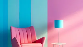
Loud neon decals are undeniably fun and offer a quick way to inject personality into a space. They tap into retro nostalgia while feeling modern. However, their specificity is also their weakness. A bright pink flamingo or a glowing cursive phrase is tied to a particular moment in design. While some argue for neon's growing role as a design essential, many designers caution that it can quickly make a space feel tacky or dated if not used with extreme care. Wall decals are also, by nature, a more temporary solution. While easy to apply and remove, they have a shorter lifespan than wallpaper and are prone to peeling over time, especially in rooms with moisture or temperature fluctuations. Their adhesive can weaken, and they are less effective at covering minor wall imperfections.
Wallpaper: An Investment in Longevity
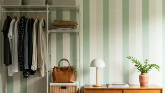
High-quality wallpaper is a more significant upfront investment, but it pays dividends in durability and timelessness. Unlike decals, which are accent pieces, wallpaper provides a seamless, architectural finish that can hide minor cracks and imperfections. When you choose a subtle, neutral colour-blocked pattern, you are creating a foundation that will outlast countless trends. This neutral backdrop offers supreme flexibility, allowing you to update your decor—from pillows and rugs to artwork and furniture—without ever needing to change your walls. Your home can evolve with your tastes, seasons, and life changes, all while being anchored by a sophisticated and calming environment.