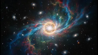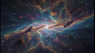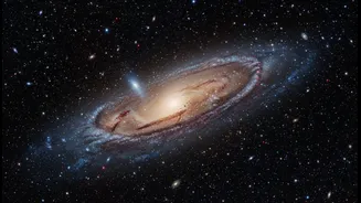






Not Just a Snapshot
The first thing to understand about photos from space telescopes like the JWST or Hubble is that they aren't created with a simple point-and-shoot camera. Raw data from the telescope often looks like a nearly black image to the naked eye. These are not
holiday snapshots; they are sophisticated visual representations of scientific data. Telescopes like the JWST are designed to see light that is invisible to human eyes, primarily in the infrared spectrum. This allows them to peer through cosmic dust clouds and see the faint light of the universe's oldest galaxies. The process of turning this invisible data into the breathtaking pictures we see on our screens is a meticulous blend of science and art, performed by science visuals developers.
The Art of 'False Colour'
Many of these images are described as using "false colour," a term that can unfortunately suggest they are fake. In reality, it's more like a translation. Since the telescope is capturing light wavelengths we can't see, scientists assign visible colours (like red, green, and blue) to different parts of that invisible spectrum. Typically, the longest wavelength of light captured is assigned red, the medium green, and the shortest blue. This allows our eyes to distinguish features that would otherwise be hidden. For instance, a specific colour might be used to highlight the presence of a particular element, like oxygen or hydrogen, or to show the temperature of gas in a nebula. It’s a coding system that helps scientists—and us—make sense of the vast amount of information packed into a single observation.
Lost in the Details
The problem is not with the images, but how the science behind them is often communicated. Alongside a stunning new picture, NASA and other space agencies typically release detailed press releases and lengthy articles. While factually rich, these are often dense, filled with jargon, and not designed for the way most people consume information today—on their phones, scrolling through feeds. The gulf between the public's understanding and scientific developments is a known challenge, and it's particularly acute when the concepts are so abstract. Expecting a casual viewer to read a multi-page PDF to understand why a galaxy looks a certain colour is unrealistic. The current method fails to capitalize on the initial moment of wonder, often leaving the deeper story untold to the widest possible audience.
The Swipe-Right Solution
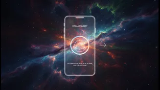
This is where simple, swipe-friendly formats come in. Imagine tapping through an Instagram or X (formerly Twitter) story. The first screen is the stunning image itself. Swipe right, and a simple animation shows how different invisible light filters were combined. Swipe again, and a short caption explains: "We coloured infrared light red to show where new stars are forming." Another swipe could show a 10-second video of an astrophysicist explaining the most exciting part of the discovery. This approach meets the audience where they are. In a mobile-first world, especially in markets like India where over 75% of users may only access the internet via smartphone, content must be tailored for this reality. Visual, bite-sized, and interactive formats like short videos, infographics, and scrolling stories are proven to be highly engaging and effective for explaining complex topics.