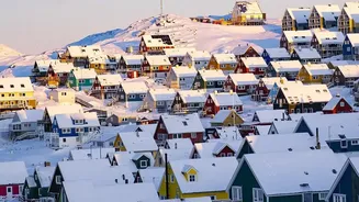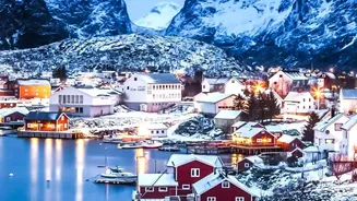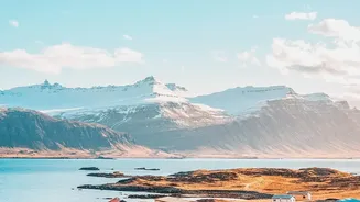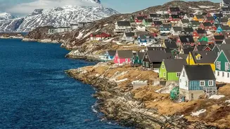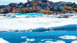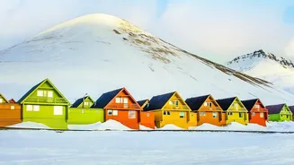




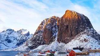
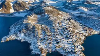
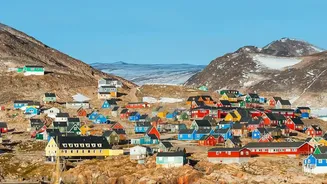
Vibrant rows of red, blue, and yellow houses cling to rocky coastlines, a striking contrast against Greenland’s vast, white landscape of ice and snow. But this iconic colourfulness is no random quirk; it's a story of practicality and history.
A Practical Splash of Colour
Imagine trying
to find your way through a blizzard where the sky and ground merge into a single white canvas. For much of the year, Greenland's environment is a world of monochrome: white snow, grey rock, and pale light. In this setting, a brightly painted house is more than just cheerful—it's a landmark. The tradition of using bold colours served a crucial, practical purpose: visibility. Strong, saturated colours make buildings easy to locate in heavy fog, snowstorms, and the long twilight of the Arctic winter. What now seems like a purely aesthetic choice was born from the need for visual anchors in one of the world's most stark and challenging environments, offering a sense of place and reassurance.
From Colonial Kits to a Colour Code
The origin of these colourful wooden buildings dates back to Greenland's colonial era, beginning around the 18th century. Before this, the Inuit population primarily lived in traditional dwellings made of stone, turf, and driftwood. Colonisation brought with it a new style of architecture. Wooden houses, often prefabricated as 'timber kits' in Scandinavia, were shipped to Greenland and reassembled. With these new buildings came a simple but effective organisational system. At a time before street names and house numbers were common, different colours were used to signify a building's function, making it easy for residents and visitors—many of whom couldn't read Danish signage—to navigate the settlements.
The Unspoken Language of a Town
For a long time, the colour of a building told you exactly what happened inside. This practical code was widely understood. Red was the colour for churches, schools, and trade-related buildings, including the homes of ministers and shopkeepers. If you needed medical attention, you looked for a yellow building, which signified a hospital or the home of a doctor or nurse. Blue was reserved for the fishing industry, identifying fish factories and the workers' houses. Green was associated with mechanics and telecommunications, while police stations were painted black. If a ship arrived in a town with a sick person aboard, the crew knew to head straight for a yellow building to find help. This system turned each town into a living, colour-coded map.
A Tradition Transformed
Today, this strict colour-coding system is no longer in use. The introduction of house numbers and modern signage made the functional code obsolete. Homeowners are now free to paint their houses any colour they wish, leading to an even wider palette that includes purples, pinks, and pastels. Yet, the tradition of vibrant colour remains deeply ingrained in Greenlandic culture. In a land with long, dark winters, these bright hues provide a powerful psychological boost, injecting a sense of life and optimism into the everyday. The practice has become a potent symbol of national identity—a joyful and resilient expression of life in the Arctic. While the original reasons were purely functional, the emotional and cultural significance of the colours has given them a new, lasting purpose.