





The Problem with Perfect White
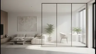
A scroll through any design feed will show you the appeal of stark white. It reflects light, makes spaces feel larger, and offers a crisp backdrop for furniture and art. Psychologically, it's linked to cleanliness and simplicity. However, that pristine
canvas is also brutally honest. Every fingerprint, every splash of coffee, every scuff from a shoe becomes a glaring imperfection. Because pure white has no undertones or variations, anything that isn't white stands out in high contrast, turning your serene space into a constant to-do list of cleaning and touch-ups. This makes it a particularly challenging choice for high-traffic areas like hallways, kitchens, and family rooms.
The Visual Magic of Warm Neutrals
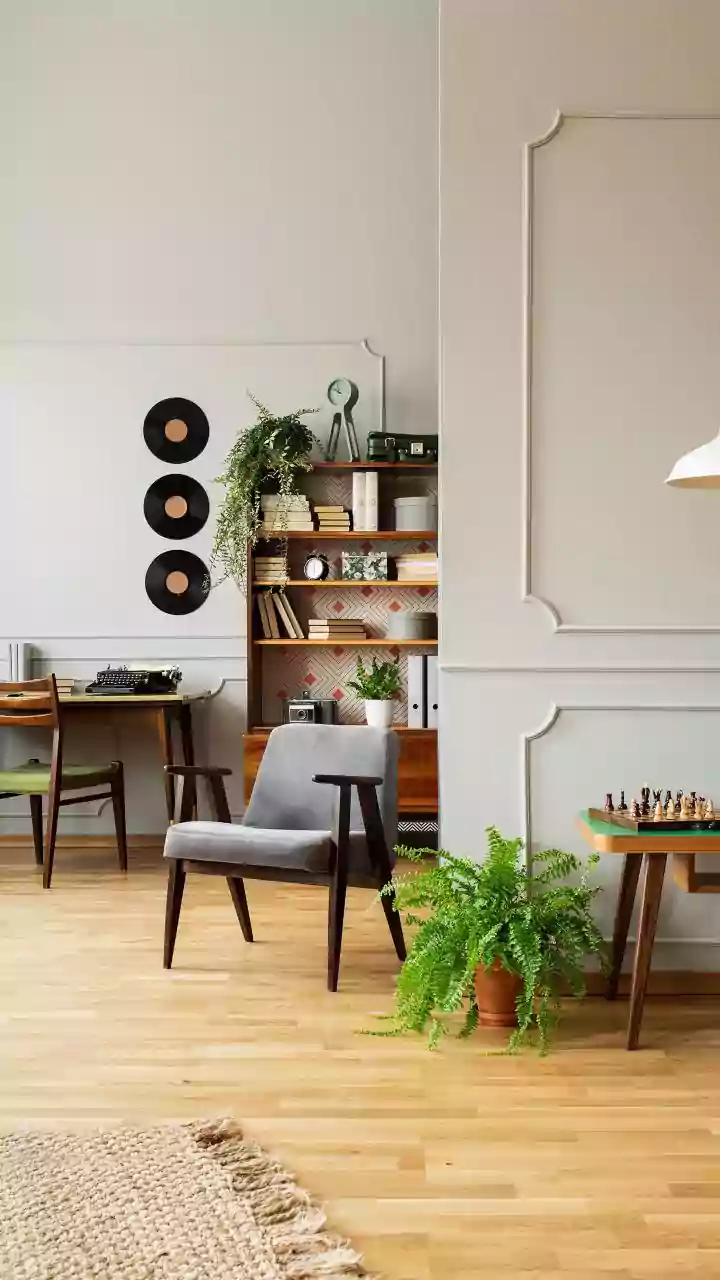
So why do warm neutrals perform so much better in the real world? The secret lies in their complexity. Colours like beige, taupe, greige, and mushroom aren't flat. They are mid-tones, meaning they sit in the middle of the light-to-dark spectrum. More importantly, they contain a mix of underlying colours, or undertones—think hints of yellow, pink, green, or brown. This subtle, inherent variation is what helps them camouflage everyday dirt and dust. A speck of dust or a minor scuff that would scream for attention on a white wall simply blends into the existing depth and warmth of a neutral, making them incredibly forgiving. They do a better job of hiding earth tones, like dirt and sand, because they share a similar palette.
Your Guide to Forgiving Hues
Ready to embrace a more livable palette? These families of warm neutrals are popular for a reason: Beige and Tan: Far from the boring builder-grade shades of the past, modern beiges are nuanced and warm. They create a cozy, inviting atmosphere without feeling dark. Shades like oatmeal or sand are linked to stability and comfort. Greige: This popular hybrid blends the warmth of beige with the modern sophistication of grey. It's a true chameleon, adapting to both warm and cool colour schemes and providing a refined backdrop that still hides minor imperfections. Mushroom and Taupe: These colours have earthy brown and grey undertones that are exceptionally good at masking scuffs and smudges. They feel sophisticated and grounding, adding depth to a room while remaining firmly in the neutral camp. Warm Off-Whites and Creams: If you love the brightness of white but need more practicality, warm whites are the answer. Colours like ivory or cream have yellow or beige undertones that soften the look and make them more forgiving than their stark counterparts. They provide warmth and prevent a space from feeling clinical.
Beyond the Paint: Sofas, Rugs, and Floors
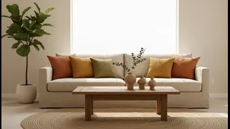
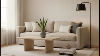
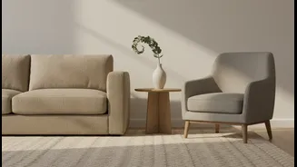
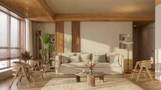
This principle isn't just for walls. Applying it to other high-use surfaces can dramatically lower your home-maintenance stress. A crisp white sofa is a daring choice, but a sofa in a warm beige, soft grey, or textured oatmeal fabric will be far more forgiving of life's little spills. The same goes for rugs and flooring. A patterned rug or a floor with natural variation, like wood-look vinyl in warm brown or gray tones, is designed to camouflage dirt and wear between cleanings. These choices build a layered, comfortable, and, most importantly, livable home where you don't have to panic about every little mark.
Keeping Neutrals from Feeling Boring
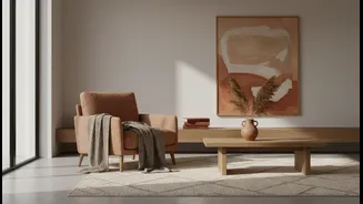
A common fear is that a neutral-heavy space will feel bland or uninspired. But a successful neutral room is all about texture and layering. To keep things interesting, mix different shades of your chosen neutral family. Pair a warm beige wall with a slightly deeper taupe sofa and a cream-coloured rug. Introduce different materials and textures: a chunky knit blanket, a woven rattan basket, a smooth leather pillow, and a dark wood coffee table. These textural contrasts create visual interest and depth, making the space feel rich and thoughtfully designed, not dull.