



Choose a Hero Piece
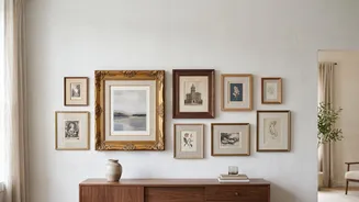
The simplest way to begin is to choose an anchor for your gallery wall. This should be your favourite or most visually striking piece of art—often, but not always, the largest one. This 'hero' artwork will serve as the foundation for your entire colour
scheme. Its dominant hues will guide your selection for the rest of the collection, creating a natural starting point. Whether it's a moody oil landscape, a vibrant abstract, or a soft floral print, the colours within this single piece will dictate the palette, ensuring the final arrangement feels intentional from the very start.
Build a Three-to-Five Colour Palette
With your hero piece selected, identify three to five key colours to build your palette. Pull these shades directly from the artwork. For example, a landscape might offer earthy greens, a dusty blue, and a warm ochre. A vintage floral might have shades of faded pink, sage green, and cream. Sticking to a limited palette of two or three core colours, plus a couple of supporting neutrals like cream or tan, is a reliable way to ensure cohesion. This doesn't mean every piece must contain all these colours, but each new artwork should feature at least one or two, creating a visual thread that ties the collection together.
Unify with Neutrals and Frames
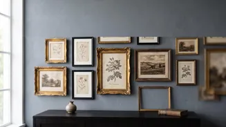
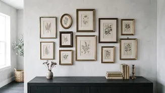
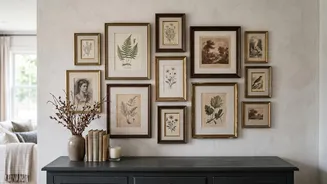
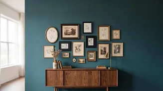
Neutrals are the unsung heroes of a vintage gallery wall. Warm whites, creams, tans, and greys create visual breathing room and prevent a collection of varied art from feeling too busy. This is also where frames play a crucial role. If your art pieces are very different, using frames of the same colour—like all black, all warm wood, or all antique gold—can instantly unify them. Conversely, if your art has a very consistent colour story, you can afford to mix frame styles more freely. Using consistent matting, such as a warm off-white for every piece, is another powerful trick for making mismatched frames and art styles feel connected.
Consider the Wall Itself
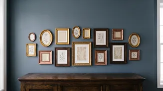
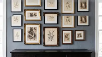
The wall behind your art is not just a backdrop; it's the largest colour in your palette. The long-held belief that all art must hang on a stark white wall is outdated. A wall colour pulled from your chosen palette can create a deeply cohesive, immersive look. For instance, a deep, dusty blue or a soft sage green on the wall can make artworks with those same tones pop. Alternatively, a neutral wall in a warm cream or soft grey allows the colours within the art to take centre stage. Either way, ensure the wall colour complements, rather than competes with, your collection.
Embrace Imperfection and Contrast
Cohesion does not mean perfect matching. In fact, a bit of controlled contrast is what gives a gallery wall life. The goal is to look collected, not like you bought everything in a single weekend. Don't be afraid to add an unexpected pop of colour through a single, smaller piece of art. This can add energy and draw the eye. Similarly, mixing textures, such as an ornate gilt frame next to a simple wood one, adds depth and character. The beauty of a vintage gallery wall lies in its personality. By establishing a strong colour foundation, you create the freedom to play with different styles, eras, and textures without the result looking chaotic.