


More Than Just Beige
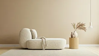
When we hear “neutral interiors,” the mind often jumps to stark, minimalist spaces that can feel cold or uninspired. But the current trend is far richer and more nuanced. Today’s neutrals are warm, earthy, and deeply connected to nature. Think of the soft
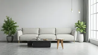
terracotta of a clay pot, the gentle grey of a cloudy monsoon sky, the warm sandiness of a Jaisalmer dune, or the subtle green of a eucalyptus leaf. These shades—including mushroom, taupe, ochre, and warm off-whites—create a sophisticated foundation that is anything but boring. They are the backdrop for a life well-lived, providing a sense of quiet luxury and organic elegance that feels both modern and timeless.
The Psychology of Calm
So, why this sudden, widespread embrace of quiet colours? The answer lies in our collective need for sanctuary. In a world that is loud, fast-paced, and digitally saturated, our homes have become our primary refuge. The pandemic amplified this, forcing us to re-evaluate our living spaces as places for work, rest, and rejuvenation. Neutral palettes are inherently calming. They reduce visual noise and mental clutter, creating a serene environment that helps us de-stress and recharge. These colours don't demand attention; instead, they provide a gentle, soothing embrace. This shift towards wellness-focused design is not just about aesthetics; it's about creating homes that actively support our mental and emotional well-being.
A Perfect Canvas for Indian Craft
One of the most compelling reasons for the rise of neutrals in India is how beautifully they complement our rich heritage of craft and textiles. A neutral wall is not an absence of culture; it is the perfect canvas to make it shine. Imagine a vibrant Phulkari tapestry, a hand-carved wooden jharokha, or a collection of gleaming brass urlis. Against a backdrop of ivory or warm grey, these objects are no longer competing for attention. Their colours, textures, and intricate details are amplified, becoming the true stars of the room. A neutral scheme allows you to celebrate your 'Pichwai' painting or your grandmother's Kanjeevaram sari framed on the wall. It’s a design approach that says 'less is more' so that what you truly cherish can be seen and appreciated.
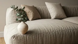
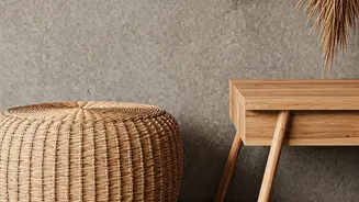
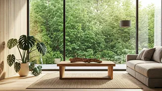
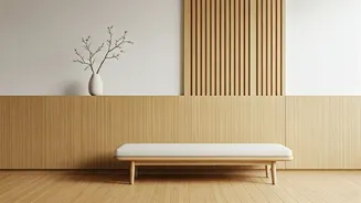
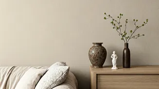
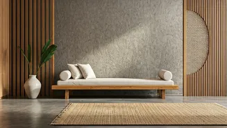
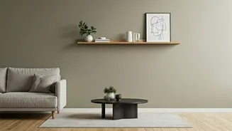
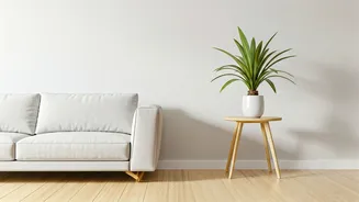
Mastering the Art of Texture
The secret to a successful neutral interior isn't the colour itself, but the interplay of textures. A room with flat, uniform beige surfaces will indeed feel bland. The magic happens when you layer different materials. Pair a smooth plastered wall with a rough-hewn wooden coffee table. Place a soft, chunky-knit throw on a sleek leather sofa. Combine jute rugs, linen curtains, ceramic vases, and rattan furniture. Each texture catches the light differently, adding depth, warmth, and visual interest. This tactile experience is what elevates a simple neutral space into a sophisticated and inviting home. In the Indian context, this means incorporating materials like khadi cotton, raw silk, and handmade paper, which bring their own unique character.
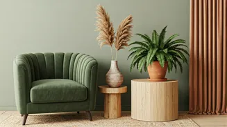
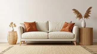
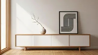
But What About Colour?
Embracing a neutral palette doesn't mean banishing colour from your home forever. In fact, it encourages a more intentional and impactful use of it. Instead of a riot of competing hues, neutrals allow you to introduce pops of colour as deliberate, powerful accents. A single armchair in a jewel-toned velvet, a set of vibrant cushions on a beige sofa, or a bold piece of abstract art can completely transform a space. The neutral foundation gives these colourful elements the space to breathe and make a statement. This approach allows for flexibility, too. You can easily switch out cushions, throws, and artwork to change the feel of your room with the seasons, without needing a complete overhaul.