



Find Your Anchor Piece
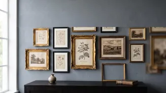
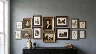
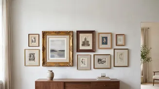
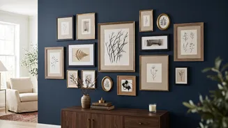
Every great gallery wall needs a hero. This is your anchor piece, and it's typically the largest or most visually dominant item in your collection. It provides a focal point and gives you a starting place to build around. Don't make the common mistake
of placing it dead center, which can feel too rigid and formal. Instead, position your anchor slightly off-center to create a more dynamic and organic layout. Once it’s placed, you can begin adding your other frames like satellites orbiting a planet, creating a sense of natural movement.
Plan Your Layout on the Floor First
Before a single nail meets the wall, your best friend is the floor. Lay out all your frames to experiment with arrangements. This no-commitment planning stage allows you to see how different sizes, shapes, and orientations interact. A great trick is to use paper templates. Trace each frame onto kraft paper or newspaper, cut them out, and tape them to the wall. You can even mark where the nail should go on each template. Live with the paper layout for a day or two, making adjustments until the balance feels right. This simple step saves you from countless nail holes and ensures you love the final composition.
Create Cohesion with a Common Thread
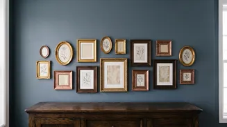
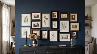
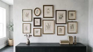
A vintage or 'salon-style' wall thrives on a collected, eclectic feel, but it still needs a unifying element to avoid looking messy. This doesn't mean everything has to match. Instead, create a subtle connection. You could stick to a limited color palette of two or three frame finishes, like mixing gold, wood, and black frames. If you repeat each finish at least twice, the mix will feel intentional. Alternatively, the theme could be the art itself, such as all black-and-white photos, botanical prints, or portraits. Even using the same color mat can tie a disparate collection of frames together.
Embrace Asymmetry and Organic Spacing
The goal of a vintage gallery wall is to look like it was gathered over time, not installed in a single afternoon. This means you should ditch perfect symmetry. Distribute your large and small frames across the entire arrangement so one side doesn't feel heavier than the other. While the layout can be organic, keep the spacing between frames relatively consistent—a gap of about 2 to 3 inches is a good rule of thumb. This creates a visual rhythm that helps the brain perceive the collection as a single, cohesive unit, even with varied frame styles and sizes.
Incorporate More Than Just Pictures
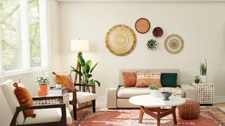
The most compelling gallery walls often feature more than just framed prints. Adding different textures and shapes creates depth and personality. Consider incorporating small, decorative mirrors, vintage plates, woven trays, or even a pair of antique wall sconces. These three-dimensional objects break up the flatness of a wall filled only with frames and add an element of surprise. The key is moderation; use these objects as accents to complement your artwork, not overwhelm it. This layering of art and objects is what truly elevates a gallery wall from a simple display to a personal story.