


Find Your Colour Story
Before you hang a single frame, decide on the mood and colour story of your gallery wall. A cohesive palette is the invisible thread that will tie everything together. You don't need to be rigid, but selecting two or three dominant colours to repeat throughout
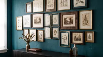
the collection creates visual harmony. Warm, muted tones like sepia, olive green, ochre, and cream often evoke a vintage feel. Look for inspiration in the room itself—perhaps pulling hues from a rug or sofa. Alternatively, let one favourite piece of art dictate the palette for the entire collection. This colour story will guide your choices as you begin to source your art and frames.
The Thrill of the Hunt
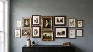
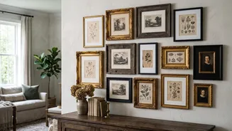
Sourcing vintage art is a treasure hunt. Flea markets, antique shops, estate sales, and online marketplaces are fantastic hunting grounds. Look for pieces that speak to you, whether it's a landscape painting, a signed sketch, a botanical print, or an old family photograph. Don't worry if the pieces seem unrelated at first; your colour palette will unite them. Pay attention to the frames, too. An ornate, gilded frame with a bit of wear can have as much character as the art it holds. The goal is to gather a collection that feels layered and personal, as if it has been assembled over time.
Unify with Frames and Matting
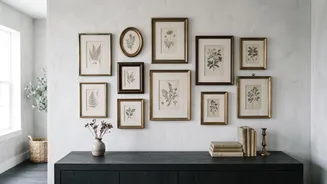
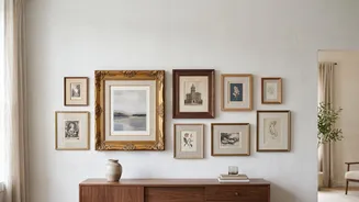
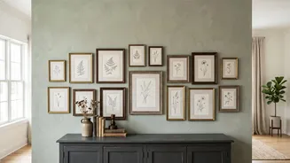
Frames can either unify a collection or accentuate its eclectic nature. To create cohesion, you can stick to a limited palette of frame colours, like natural woods, black, and antique gold. Mixing frame styles is encouraged, but repeating a colour or finish like brass helps tie them together. Another powerful tool is matting. Using the same colour mat—often white or off-white—for different pieces creates breathing room and makes varied frame styles and colours feel more connected. Conversely, for art that isn't matted, the aged look can feel especially authentic.
More Than Just Pictures
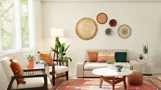
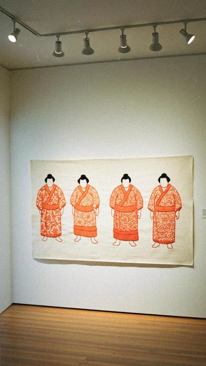
A truly captivating gallery wall often includes more than just framed prints. Incorporating objects with different textures adds depth and personality. Consider adding a small mirror, a woven textile, a decorative plate, or even a small shelf with a sculptural object. These three-dimensional items break up the flatness of a wall of frames and enhance the collected, curated feeling. Just ensure these unexpected elements align with your chosen colour palette to maintain the overall sense of harmony. The contrast in materials, from a smooth ceramic plate to a rustic woven piece, makes the entire display more dynamic.
The Art of Arrangement
Once you've gathered your collection, resist the urge to start hammering nails immediately. The best practice is to lay out your entire arrangement on the floor first. This allows you to experiment with placement, balance, and spacing without commitment. Start with your largest piece as an anchor, placing it at or near eye level, and build outwards with smaller works. Play with both symmetrical and asymmetrical layouts to see what best suits your space. Maintain a relatively consistent spacing between frames—around two to three inches is a good rule of thumb—to give the final arrangement a clean, intentional look.