

Establish Your Narrative Theme
Before you hang a single frame, decide on the story your wall will tell. A vintage theme is a great start, but narrowing it down provides crucial direction. Are you aiming for a '70s bohemian vibe with warm, earthy tones, or a sophisticated Art Deco feel
with geometric shapes and metallics? Perhaps you're drawn to rustic farmhouse charm with weathered wood and botanical subjects. Choosing a specific mood or theme—like travel, nature, or family history—acts as your curatorial guide. This narrative thread is what transforms a random assortment of pictures into a purposeful collection that feels uniquely yours. Every piece you select should connect back to this core idea in some way, whether through subject matter, style, or emotional tone.
Curate a Balanced Collection
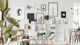
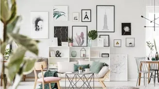
A successful mixed-media wall thrives on variety, but balance is key. Think about your collection in terms of visual weight. You can combine personal photos, art prints, and even original paintings, but there should be a unifying element. This could be a recurring subject, such as landscapes, or a specific artistic style, like black-and-white portraiture. Don't be afraid to mix orientations (vertical and horizontal) and sizes, as this creates rhythm and movement. A good rule of thumb is to anchor the collection with one or two larger, statement pieces and then fill in the surrounding space with smaller and mid-sized works. You can even incorporate three-dimensional objects like small mirrors or textiles to add texture and break up the flatness of a purely print-based display.
Unify with a Cohesive Palette
Color is one of the most powerful tools for tying a diverse collection together. A consistent color palette will make your gallery wall feel harmonious, even if the art spans different styles and eras. For a vintage look, lean into warm, muted tones like sepia, ochre, olive green, and charcoal. You don't have to be rigid; you can work within a single color family (like different shades of blue) or stick to a simple two- or three-color rule complemented by neutrals like cream or black. Black-and-white or sepia-toned photographs are a perfect fit for a vintage theme, instantly adding a sense of history and warmth. This shared tonality ensures the overall display looks curated, not chaotic.
Framing for a Collected Look
Frames are the secret ingredient that pulls everything together. You have two main approaches: uniform or eclectic. Using identical frames creates a formal, modern look, but for a vintage aesthetic, a mix-and-match approach often feels more authentic and 'collected over time'. To keep a mixed-frame wall from looking messy, limit your choices to two or three styles or colors, such as a combination of dark wood, ornate gold, and simple black frames. This limited palette provides cohesion while allowing for variety in shape and texture. Another technique is to use different frame styles but unify them with a consistent color of matting. However, for a truly antique feel, consider forgoing bright white mats altogether unless they are a period-appropriate off-white.
Master the Art of the Layout
Once you have your pieces, plan the layout before making any holes in the wall. A tried-and-true method is to trace each frame onto paper, cut out the templates, and arrange them on your wall with painter's tape. This allows you to experiment freely. Start by placing your largest anchor piece, typically with its center at eye level (around 57-60 inches from the floor), and build outwards. Maintain a consistent spacing of about 2-3 inches between frames to create a sense of order, even in an asymmetrical or 'salon-style' layout. Live with the paper layout for a day or two, making adjustments until the balance feels right. This planning step ensures the final arrangement is dynamic, balanced, and perfectly suited to your space.