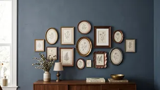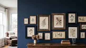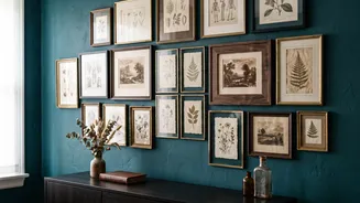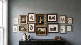

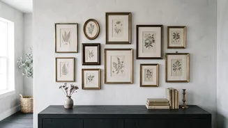


Curate Your Collection First
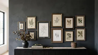
Before you think about layouts, decide what story you want to tell. The most successful vintage gallery walls feel collected over time, even if you gathered the pieces recently. Start by choosing a mood or theme, such as 'misty landscapes', 'sepia-toned
family portraits', or 'botanical studies'. This unifying element will guide your selections and ensure the final arrangement feels cohesive rather than random. Mix personal photos with vintage prints, paintings, and even three-dimensional objects like small mirrors or decorative plates for added texture and depth. The goal is to create a collection that looks layered and personal.
Master the Mix of Frames
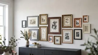
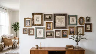
For a vintage look, mismatched frames are essential. The trick is to make the mix look intentional, not accidental. Limit yourself to two or three dominant frame colors or materials, such as antique gold, dark wood, and black. This limited palette provides a visual thread that ties everything together. Don't be afraid to combine ornate, detailed frames with simpler, more modern ones. The contrast between a simple black frame and an aged gilt one can add significant visual interest, so long as there's a common element—like a similar color in the artwork or a consistent mat color—to connect them.
Find Your Anchor and Build Around It
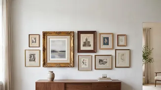
Every gallery wall needs an anchor piece. This is typically your largest or most visually dominant work, and it serves as the starting point for your entire layout. Instead of placing it dead-center, which can feel rigid, try positioning it slightly off-center at eye level—generally, the middle of the piece should be about 57-60 inches from the floor. This encourages the viewer's eye to travel around the entire collection. Once your anchor is set, you can begin arranging the smaller pieces in orbit around it, balancing visual weight across the composition.
Map It Out on the Floor
This is the most crucial step to avoid unnecessary nail holes. Before you touch the wall, lay your entire collection on the floor. Use painter's tape to mark out the dimensions of your available wall space, factoring in any furniture like a sofa or console table. A good rule of thumb is that the gallery wall's width should be about two-thirds of the furniture below it, with the lowest frames hanging 6 to 8 inches above the furniture. Arrange and rearrange your framed pieces within the taped-off area until the balance feels right. Mix horizontal and vertical orientations and spread out frames with similar colors or 'visual weight' so they don't cluster together.
Create Paper Templates for the Wall
Once you are happy with your floor layout, it's time to transfer it to the wall for a final check. Trace each of your frames onto craft or butcher paper and cut them out. On each paper template, make a small mark where the nail or hook needs to go—this is a critical detail that saves a lot of guesswork later. Using painter's tape, stick the paper templates onto your wall, replicating the arrangement you created on the floor. This allows you to live with the layout for a day or two and see how it looks in different light. You can easily make adjustments without any commitment.
Maintain Consistent Spacing
The secret to a polished, professional-looking gallery wall is consistent spacing. Even if your frames and art styles are eclectic, the negative space between them should be uniform. Aim for a gap of two to three inches between each frame. Inconsistent spacing is often what makes a gallery wall feel messy or unintentional. During the paper template stage, use a ruler or a small piece of cardboard cut to your desired width as a spacer to ensure the gaps are even throughout the entire arrangement. This small detail makes a huge difference in creating a single, cohesive visual statement.