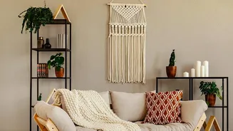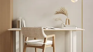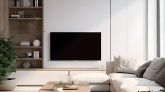

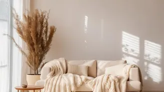
The End of the 'Sad Beige' Era
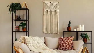
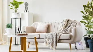
The long-standing dominance of beige, greige, and other muted neutrals in interior design is finally waning. What once felt like a sophisticated, minimalist statement now often feels predictable and emotionally flat for many homeowners. This shift isn't
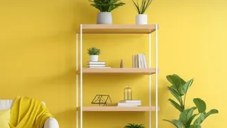
just about being tired of one colour; it's a reaction to a period where our homes became our entire worlds. The desire for spaces that feel personal, expressive, and joyful has grown, leading many to question the 'safe' choice. The term 'sad beige' emerged to describe interiors that, in their quest for serene minimalism, stripped out personality. Now, the pendulum is swinging towards what some call 'dopamine decor,' focusing on creating mood-boosting, vibrant spaces that reflect the people who live in them.
From Monotone to Mindful Colour
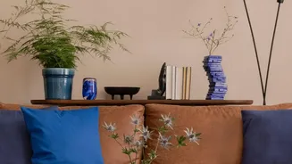
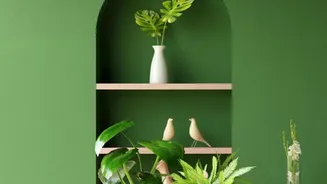
The reversal of the beige trend doesn't mean a chaotic explosion of clashing colours. Instead, it's about a more thoughtful and intentional approach. The new wave of popular colours is nuanced, pulling from nature and offering warmth and character. Designers are embracing muted greens like sage and olive, earthy terracottas, dusky pinks, and rich cola browns. Even shades of blue are being used to add depth and dimension to a space, providing a refreshing alternative to overused neutrals. This shift is less about one specific colour taking over and more about using a richer, more complex palette to create atmosphere. The goal is to move beyond visual emptiness and embrace sensory calm and character.
The New Case for a Balanced Palette
As we move away from single-colour dominance, understanding how to create a balanced colour palette is more important than ever. A balanced room feels cohesive and intentional, not chaotic. This is where a timeless interior design principle, the 60-30-10 rule, becomes incredibly useful for navigating the post-beige world. The rule provides a simple framework to ensure colours are distributed harmoniously, preventing any one shade from overpowering the space. It gives you a recipe for balance, allowing you to confidently experiment with the new, richer colours that are defining modern interiors without fear of creating a space that feels busy or visually jarring.
Applying the 60-30-10 Rule
The 60-30-10 rule is straightforward. It suggests that 60% of your room should be a dominant colour, 30% a secondary colour, and 10% an accent colour.
60% (Dominant Colour): This is the main colour for your room and serves as the backdrop. Think walls, large rugs, or a large sofa. This could still be a neutral, just not the only colour. A soft greige, warm white, or even a muted green could work.
30% (Secondary Colour): This colour is used for about half the area of your dominant colour. It’s there to add contrast and interest. This is where you might find your accent chairs, curtains, or a painted piece of furniture.
* 10% (Accent Colour): This is your splash of personality. It's used for smaller items like throw pillows, decorative accessories, and artwork. This is where you can be bold with a vibrant terracotta or a deep blue.
Beyond Colour: Texture and Tone
One of the criticisms of the all-beige aesthetic was its tendency to feel one-dimensional and flat. As you introduce more colour, don't forget the crucial role of texture. A truly balanced and interesting room layers different materials to create depth and warmth. Think about mixing rough and smooth, hard and soft. A plush velvet cushion, a chunky knit throw, the smooth finish of a metal lamp, and the natural grain of a wooden table all contribute to a room's character. Even within a colour family, you can play with different tones—lighter and darker shades of your chosen green or blue—to create a sophisticated, layered look that feels far more dynamic than a single flat colour ever could.
How to Start Your Colour Journey
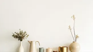
Moving from a completely neutral space to a colourful one can feel daunting. The key is to start small and make low-commitment changes. You don't need to repaint the entire living room overnight. Begin with the 10% accent. Swap out your beige cushions for ones in a dusky pink or a rich brown. Add a piece of vibrant artwork that introduces several new shades to the room. A patterned lampshade, a colourful rug, or even a collection of decorative vases can be enough to break up the monotony and introduce the principles of a balanced palette. Once you see how a little colour can energize the space, you'll gain the confidence to take on bigger changes.