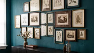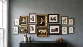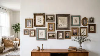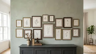

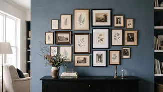
Curate Your Vintage Collection
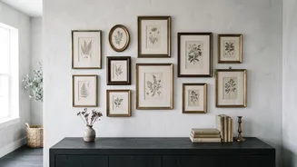
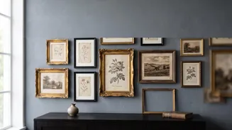
The charm of a vintage gallery wall lies in its 'collected over time' feel. Before thinking about layout, gather all your potential pieces. This includes flea market paintings, heirloom portraits, sepia-toned photographs, botanical prints, and even small
mirrors or textiles. To create harmony among disparate items, look for a common thread. This doesn't have to be rigid. You could focus on a warm, muted color palette (like ochre, olive, and cream), a recurring subject matter (like landscapes or portraits), or a consistent frame tone (like mixing walnut, antique gold, and black). Limiting your frame finishes to two or three varieties helps the collection feel intentional rather than chaotic.
Establish Your Anchor Piece
Every great gallery wall needs a focal point, often called the 'anchor piece'. This is typically your largest or most visually striking item. It provides a starting point and helps ground the entire arrangement. Contrary to what you might think, it’s often best to place this piece slightly off-center within your planned layout. This encourages the eye to travel across the entire collection rather than stopping abruptly in the middle, creating a more dynamic and engaging display. Once your anchor is placed, you can begin building the rest of the composition around it.
The Foolproof Paper Template Method
Before you pick up a hammer, grab some craft paper or old newspaper. This is the most crucial step for avoiding unnecessary nail holes. Trace each of your frames onto the paper and cut them out. Using painter's tape, arrange these paper templates on your wall. This allows you to visualize the final layout and make endless adjustments without any commitment or wall damage. You can live with the paper arrangement for a day or two to see how you feel about it in different light. This method is especially helpful for complex spaces like stairways or walls with existing furniture. Laying the frames on the floor first is another great way to play with the arrangement before taping anything to the wall.
Choose Your Arrangement Style
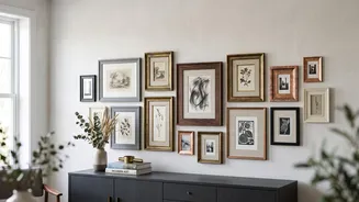
While vintage gallery walls often lean towards an eclectic, salon-style arrangement, understanding different layouts helps. A 'salon' or 'asymmetrical' layout involves mixing various sizes, orientations (horizontal and vertical), and frame styles for a dynamic feel. This approach works beautifully for vintage collections. For a more formal look, a 'grid' layout uses identical frames and uniform spacing, which can be striking with a series of similar prints, like black-and-white photos. Another option is a 'center-aligned' layout, where frames of different sizes are all aligned along a single horizontal or vertical line. For a vintage wall, mixing horizontal and vertical pieces is key to creating visual interest and rhythm.
Mastering the Space Between
Consistent spacing is the invisible glue that makes a gallery wall look polished and professional. Too much space and the pieces feel disconnected; too little and the wall looks cluttered. A good rule of thumb is to maintain a gap of 2 to 4 inches (or about 5 to 8 centimetres) between each frame. This gap should be consistent throughout the arrangement, even in an asymmetrical layout. If hanging art above furniture like a sofa or console table, leave about 6 to 8 inches (15 to 20 centimetres) between the bottom of the lowest frame and the top of the furniture to create a visual connection. The center of the entire gallery arrangement should ideally be at eye level, which is typically around 57 inches (about 145 centimetres) from the floor.