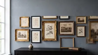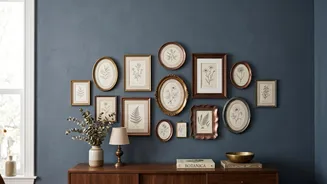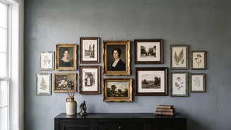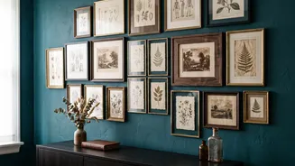



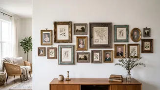
Start With an Anchor Piece
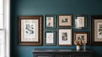
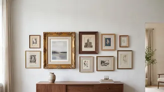
Every successful gallery wall needs a focal point. Before you hang anything, choose your 'anchor'—this is typically your largest or most visually commanding piece. Don't make the common mistake of placing it dead centre. Instead, position it slightly
off-centre at eye level, which is generally around 57 to 60 inches from the floor. This creates a more dynamic, natural starting point. All other frames will be arranged in relation to this main piece, so it gives the entire composition a solid foundation.
Balance, Don't Symmetrise
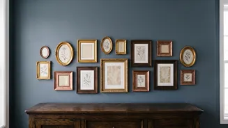
The goal is visual balance, not perfect mirror-image symmetry. Think of it like a scale. If you place a large, heavy frame on one side of your anchor, balance it on the other side with a grouping of two or three smaller frames. This distribution of 'visual weight' is key. A dark, ornate frame carries more weight than a slim, light-coloured one of the same size. Spread these heavier pieces across the layout, often diagonally from one another, to ensure no single area feels overloaded. Mixing vertical and horizontal orientations also adds to this dynamic, collected-over-time feel.
Maintain Consistent Spacing
The secret ingredient that makes an eclectic mix of frames look cohesive is consistent spacing. Aim for a uniform gap of about 2 to 3 inches between each frame. This negative space acts like an invisible grid, uniting the different sizes and styles and preventing the wall from looking cluttered. Too much space can make pieces feel disconnected, while too little makes them feel crowded. Sticking to one measurement for all the gaps creates a polished, intentional look, even in the most asymmetrical arrangement.
Unify With a Common Thread
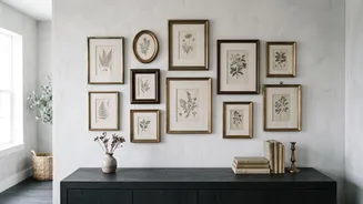
With vintage frames, you're often working with a variety of materials and finishes—gilded wood, burnished metal, simple black. To prevent chaos, establish a unifying theme. This doesn't mean everything has to match. One effective strategy is to pick two or three frame colours or materials and repeat them throughout the display. For example, having at least two gold frames and two wood frames makes the mix feel deliberate. Alternatively, the art itself can provide the connection, such as a consistent palette of sepia tones, a theme of botanical prints, or all black-and-white photos. Using the same colour mat for different pieces is another professional trick to create harmony.
Plan Your Layout on the Floor
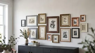
Before a hammer touches the wall, do a dress rehearsal. Lay all your frames out on the floor in front of the wall you plan to use. This allows you to experiment freely, shuffling pieces around until the balance feels right. Once you have an arrangement you love, trace each frame onto craft paper or newspaper, cut out the templates, and tape them to the wall. This crucial step lets you live with the layout for a day or two and make adjustments without creating unnecessary nail holes. You can perfect the height, spacing, and overall shape before committing.