

The End of the 'Sad Beige' Era
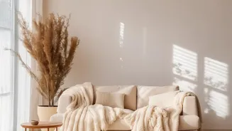
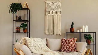
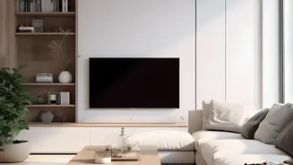
For the better part of a decade, minimalism reigned supreme, and its chosen colour was beige. From 'greige' walls to oatmeal-coloured sofas, the neutral palette was seen as sophisticated, safe, and a smart choice for resale value. But after years of scrolling
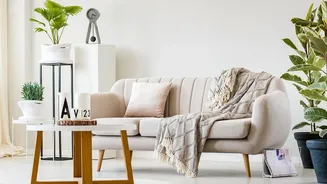
through seas of sameness, a collective fatigue has set in. What once felt chic and calming now often feels flat and impersonal, leading to the online moniker of the "sad beige aesthetic". Designers report a significant shift in 2026, as people now want their homes to reflect their own stories and personalities, not just conform to a muted, one-size-fits-all trend. The consensus is clear: our homes should be a source of joy and expression, and that often involves embracing colour.
Why Our Brains Crave Colour
This move away from monochrome isn't just a fleeting trend; it's rooted in the way we experience the world. Colour psychology, the study of how hues affect human behaviour and emotion, tells us that the colours we surround ourselves with have a real impact on our mood. Warm colours like terracotta and dusky pinks can create a sense of comfort and sociability, while cooler tones like blue and green promote calmness and focus. An all-beige room, while tranquil to some, can lack the emotional cues that create a dynamic and inspiring environment. Introducing varied colours allows us to craft spaces that not only look good but also support our well-being, whether we need a vibrant, energetic kitchen to start the day or a serene, blue-hued bedroom for restful sleep.
The Art of a Balanced Palette
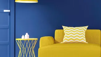
The reversal of the beige trend isn't a call for chaotic, clashing interiors. The key is 'balance'. A well-designed, colourful room isn't about using every shade in the box; it's about thoughtful curation. A timeless interior design principle is the 60-30-10 rule. This guideline suggests your dominant colour (often a neutral, like a warmer, more sophisticated beige) should cover about 60% of your space, typically the walls. A secondary colour takes up 30%, used for furniture, curtains, or an accent wall. Finally, a vibrant accent colour makes up the final 10%, popping up in cushions, artwork, or decorative objects. This simple formula ensures the room feels cohesive and intentional, not overwhelming. It allows colour to add character without sacrificing harmony.
Easy Ways to Introduce Colour
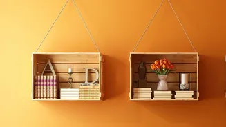
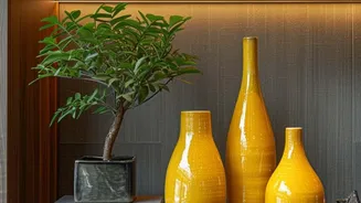
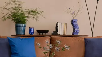
If you've been living in a neutral world, diving headfirst into a bold wall colour can feel intimidating. The good news is you don't have to. The easiest way to start is with elements that are simple to change. Textiles are your best friend here: think colourful cushions, a patterned rug, or a rich velvet throw. These items can instantly lift a room and can be swapped out as your confidence grows. Another powerful tool is artwork. A large, vibrant piece can serve as the focal point and colour inspiration for the entire room. Even something as simple as a cluster of colourful vases or a statement lamp can begin to break up the monochrome and inject that much-needed personality back into your space.
Neutrals Aren't Over, Their Role Has Changed
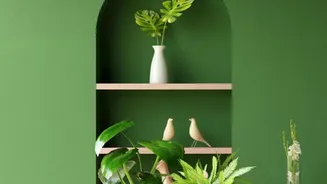
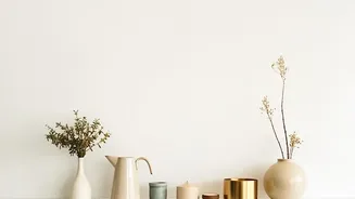
Making a case for colour doesn't mean abandoning neutrals entirely. In fact, their role is more important than ever. The new neutrals of 2026 have more warmth and character—think earthy browns, deep greens, and rich taupes. These shades serve as a sophisticated foundation that allows bolder colours to shine. Beige is no longer the star of the show; it's the essential supporting actor. It provides the calm backdrop against which more expressive colours can tell their story. The goal is to create a layered, dynamic space where deep, grounded shades balance vibrant accents, resulting in a home that feels both timeless and deeply personal.