


The Illusion of Space
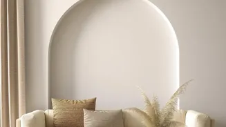
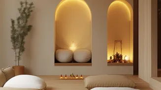
The magic behind a neutral colour scheme lies in the science of perception. Light, neutral tones like soft whites, beiges, and pale greys are highly reflective. They bounce natural and artificial light around a room, creating an immediate sense of brightness
and airiness. Unlike dark, saturated colours that absorb light and make walls feel like they are closing in, light neutrals visually recede, making the boundaries of a room seem farther away than they actually are. This optical illusion is one of the most effective strategies for making a small space feel significantly more open and expansive without moving a single wall.
Creating a Seamless Visual Flow
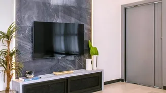
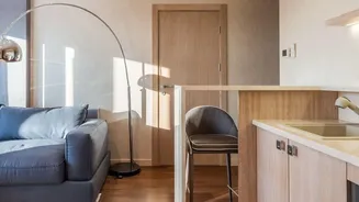
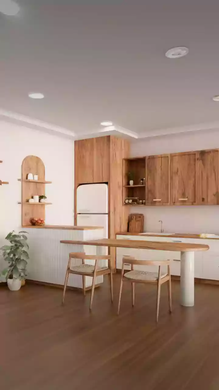
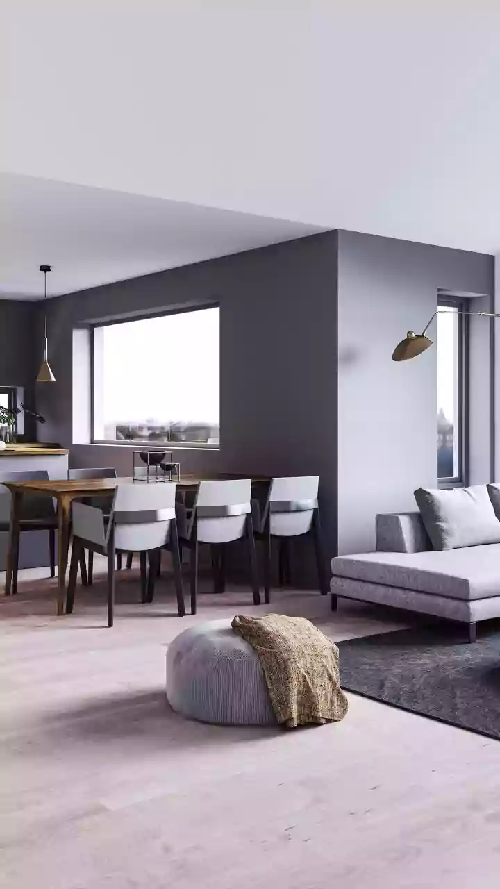
A key goal in small-space design is to create a 'seamless' look, where the eye can travel effortlessly through the space without interruption. When you use a single, unified colour palette across walls, and even major furniture pieces, you minimize visual breaks. This cohesion prevents the space from feeling choppy or fragmented, a common issue in studio apartments or homes with open-plan layouts. A consistent colour story helps to unify different zones, making the entire home feel like one harmonious entity rather than a collection of small, disconnected areas. This approach creates a calming, uncluttered backdrop that is both sophisticated and restful.
Renter-Friendly Ways to Apply the Palette
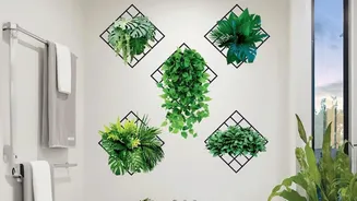
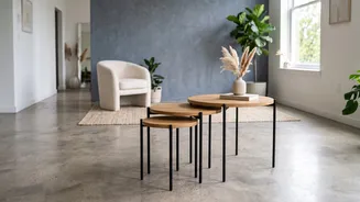
You don’t need to own your home to master this look. If your landlord has already blessed you with neutral walls, you're halfway there. But even if painting isn't an option, you can still build a unified look. Focus on large, impactful items. A large, light-coloured area rug can make a floor feel more spacious and set the foundation for your palette. Choose sofas, chairs, and shelving units in complementary neutral tones like cream, greige, or soft grey. Even if you have mismatched furniture, you can unify it with slipcovers or by painting select pieces. For walls, consider using renter-friendly peel-and-stick wallpaper in a neutral texture or pattern to create a feature wall without a long-term commitment.
The Power of Texture and Tone
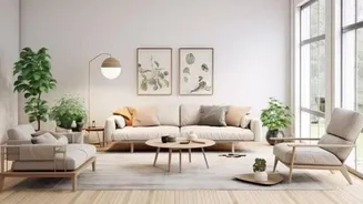
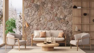
A common fear with neutral palettes is that they will feel boring or sterile. The secret to an elegant and inviting neutral space is texture. Layering different materials adds depth and interest, preventing the room from feeling flat. Think about incorporating a variety of textures: a plush wool rug, velvet cushions, a chunky knit throw, linen curtains, and woven baskets. These tactile elements engage the senses and create a rich, sophisticated environment. Furthermore, a neutral palette isn't just one colour. Play with different tones within the same family—like layering various shades of grey or beige—to create a dynamic, monochromatic scheme that adds depth while maintaining harmony.
Finishing with Cohesive Decor
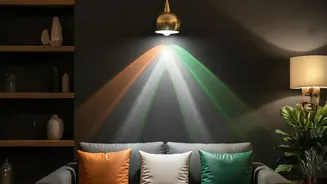
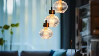
Once your foundational neutrals are in place, the final layer of decor ties everything together. Use the 60-30-10 rule as a guide: 60% dominant neutral, 30% secondary neutral, and 10% for a subtle accent. This accent doesn't have to be a bright colour; it could be a metallic finish like black or brass for hardware and light fixtures, or the natural tones of wood and plants. Carry these accent materials throughout the space in small doses—think photo frames, decorative objects, and table lamps. This repetition creates the intentional, cohesive feeling that defines a well-designed, elegant interior.