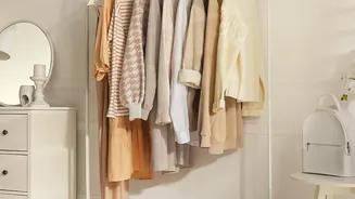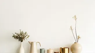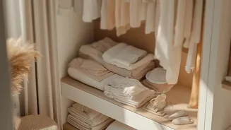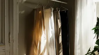

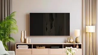
The Reign of Restful Beige
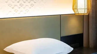
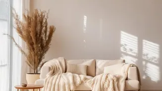
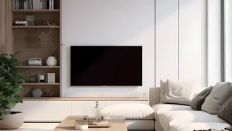
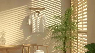
The all-beige interior aesthetic rose for good reason. In a chaotic world, it offered a visual sanctuary. Inspired by minimalism and the desire for clean, uncluttered spaces, colors like beige, cream, and greige became a go-to palette. This look, often
associated with the 'quiet luxury' trend, promised a timeless and reliable backdrop that felt safe and sophisticated. It was easy to execute and even easier to live with, creating a sense of order and tranquility when life outside the home felt loud. The goal was to create a space that felt serene and polished, a neutral zone free from the clutter of bold decisions.
Why We're Craving Color Again
So, what changed? After years of living in these neutral-drenched spaces, a collective sense of boredom has set in. What once felt calming now can feel flat, one-dimensional, or even generic. As we spend more time at home, there's a growing desire for our living spaces to reflect our personalities and feel more emotionally restorative. Designers note a significant shift away from interiors that feel staged for social media or resale, and toward homes that feel unique and lived-in. The search for authenticity is leading people to trade the safety of beige for the joy of self-expression through color and texture.
The Rise of Warmer Contrasts
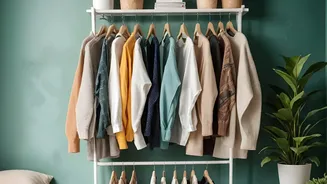
The reversal of the beige trend doesn't mean a return to jarring, loud color schemes. Instead, the focus is on 'warmer contrasts' and 'cozy minimalism'. This involves pairing a neutral base with richer, more complex hues that add depth and character. Think less about stark white and beige and more about earthy, nature-inspired palettes. Popular combinations for 2026 include soft terracotta, dusty pink, muted sage green, and deep cola browns. These shades provide the comfort of a neutral but pack more personality, shifting with the light to create a dynamic and inviting atmosphere. It’s about creating a layered, harmonious look that feels both timeless and personal.
How to Introduce Warmth (Without a Total Redo)
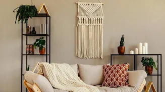
Embracing this trend doesn't require you to repaint your entire house. The key is to start small and add layers. Introducing a single intentional color can have a bigger impact than a room full of safe neutrals. Consider adding contrast through textiles like a vibrant rug, patterned cushions, or rich velvet curtains. A statement piece of furniture in a warm wood or a deep, saturated color can instantly ground a neutral room. Even something as simple as colorful artwork or a painted accent wall in a moody, earthy tone like a rich brown or a forest green can completely transform the feeling of a space, making it feel more intentional and alive.
Redefining the Neutral
Perhaps the biggest takeaway from this trend shift is the expanding definition of 'neutral'. It no longer just means beige or gray. Nuanced, earthy shades like mossy green, soft mauve, and warm charcoal are now being used as foundational colors. Even paint brands are highlighting deeper, moodier tones as the 'new neutrals'. Benjamin Moore’s 2026 Color of the Year, 'Silhouette', is a dramatic blend of chocolate and charcoal, designed to be both a grounding force and a statement. These colors prove that a base palette can have character and warmth, providing a sophisticated backdrop for other elements in a room to shine.