


From Pretty Pictures to Powerful Data
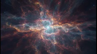
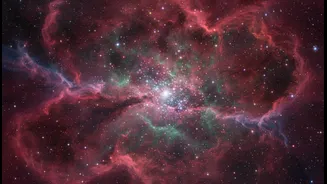
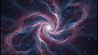
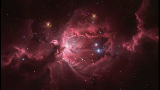
When you see a vibrant image of the Carina Nebula or the Pillars of Creation, you're looking at a story that’s thousands of light-years away and thousands of years old. Nebulae are vast, interstellar clouds of dust and gas, primarily hydrogen. Some are stellar nurseries,
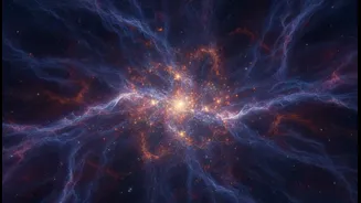
where gravity pulls material together to form new stars; others are the remnants of dying stars that have cast their outer layers into space. While undeniably beautiful, these photographs are not just for show. They are sophisticated visual representations of scientific data. Astronomers use them to map the composition, temperature, and structure of these cosmic clouds, gaining crucial insights into the life cycle of stars and galaxies.
Seeing the Invisible Universe
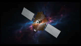
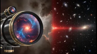
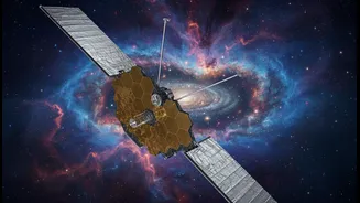
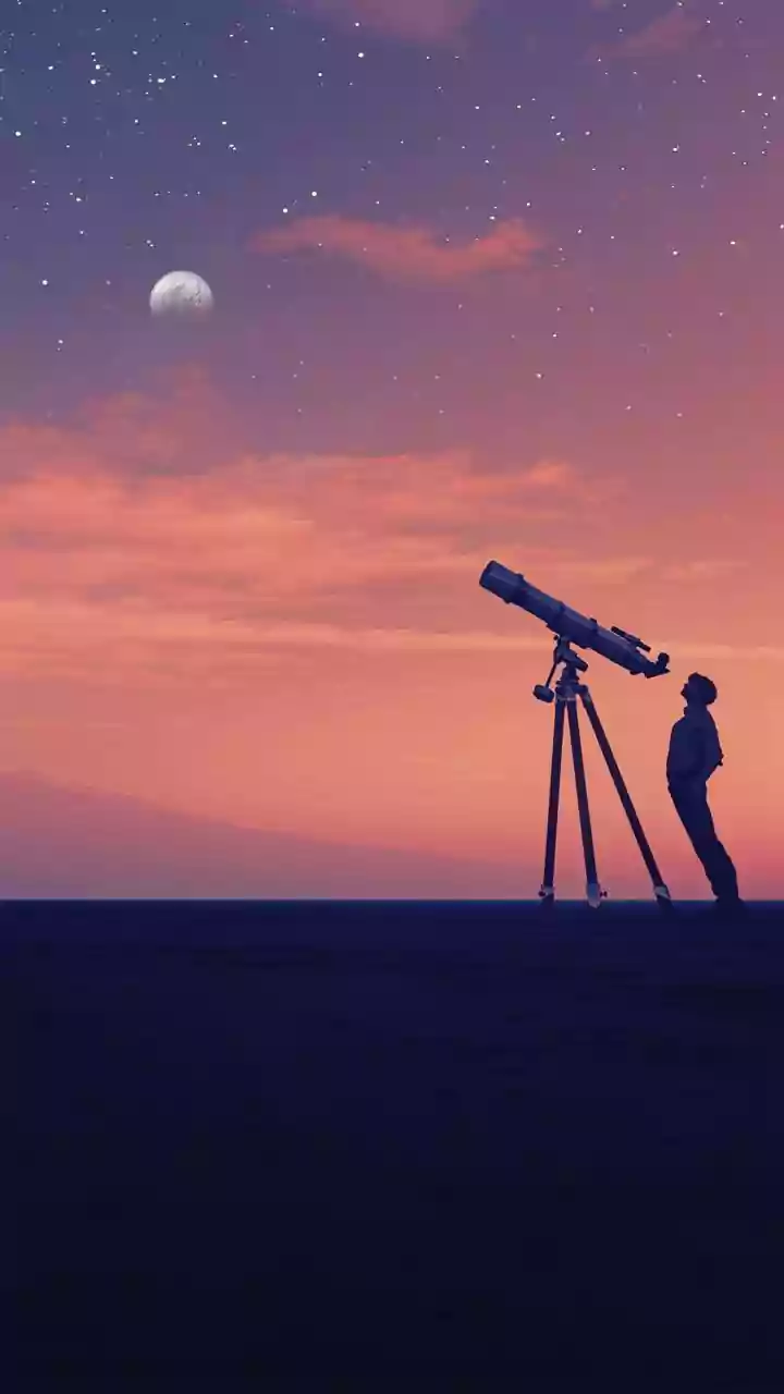
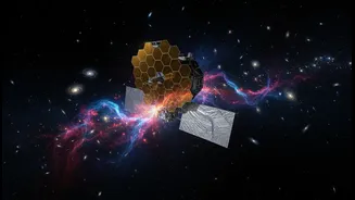
Our eyes can only perceive a tiny fraction of the light spectrum. Much of the universe’s drama unfolds in wavelengths we cannot see, such as infrared and ultraviolet light. This is where space telescopes like the Hubble and the James Webb Space Telescope (JWST) come in. JWST, in particular, is designed to see the universe primarily in infrared light. This allows it to peer through dense clouds of cosmic dust that would otherwise obscure our view, revealing newborn stars nestled deep within nebulae. The telescopes capture this invisible light using highly sensitive detectors, taking multiple exposures, sometimes over many hours, to gather enough light from these faint, distant objects.
A Symphony of False Colour
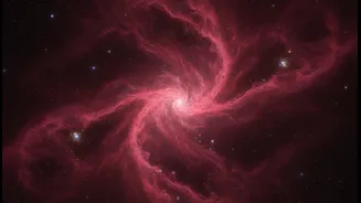
The brilliant colours in most nebula photos are not what you would see if you were looking through a telescope eyepiece. Since much of the data is collected in non-visible wavelengths like infrared, scientists must translate this information into colours we can understand. This process is often called “false colour” or “representative colour” imaging. Scientists assign different colours (typically red, green, and blue) to different wavelengths of light captured by the telescope's filters. Usually, the longest wavelengths are assigned to red and the shortest to blue, mimicking the visible spectrum. This technique isn’t meant to deceive; it’s a way to visualise scientific information, highlighting different chemical elements or physical processes. For instance, a specific shade of red might represent the glow of sulfur, while blue indicates the presence of oxygen.
Decoding the Pillars of Creation
One of the most iconic space images, the Pillars of Creation within the Eagle Nebula, is a perfect example of science made visual. First captured by Hubble in 1995, these towering columns of gas and dust are regions of active star formation. The visible-light image showed the dramatic, sculpted shapes of the pillars. However, when Hubble and later JWST imaged the same region in infrared light, they were able to pierce through the opaque dust. These infrared views revealed the fledgling stars forming inside the pillars—bright spots that were previously hidden. By comparing the visible and infrared images, astronomers can get a more complete picture of how the intense radiation from nearby massive stars is shaping the pillars while also triggering the birth of new ones.
Inspiring a New Generation
Beyond their immense scientific value, these stunning photographs play a crucial role in public engagement. The complexity of astrophysics can be daunting, but an awe-inspiring image of a nebula can capture the imagination in a way that charts and graphs cannot. It serves as a gateway, making the cosmos more accessible and sparking curiosity about our place in the universe. By turning abstract data into something profoundly beautiful, astrophotography helps bridge the gap between scientific research and the public, inspiring future astronomers, scientists, and stargazers. These images remind us that science is not just a collection of facts but a deeply human pursuit of knowledge and wonder.