



The End of the White Box Era
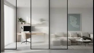
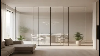
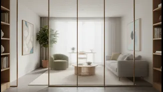
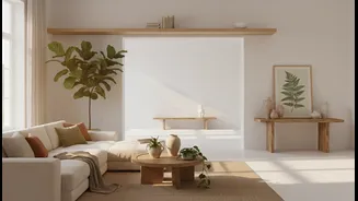
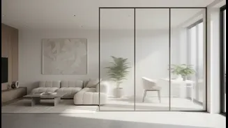
The all-white aesthetic, popularised by modern farmhouse and minimalist trends, promised a bright, clean, and spacious feel. It became the default for renovations and new builds, a seemingly safe choice for creating a light-filled home. However, many
have discovered the downside of living in a white box. These spaces can often feel cold, sterile, and impersonal. More practically, pure white is notoriously high-maintenance. It highlights every scuff, smudge, and speck of dust, making it a stressful choice for households with pets, children, or just the normal mess of daily life. As people spend more time at home, the desire for a space that feels like a sanctuary, rather than a showroom, has grown stronger.
The Rise of Warm, Natural Hues
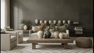
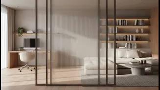
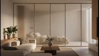
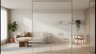
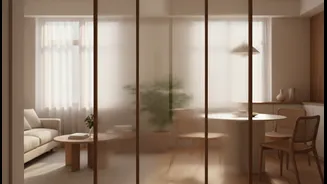
In place of stark white, designers and homeowners are embracing a family of “new neutrals.” This palette is drawn directly from nature, featuring warm, earthy tones that ground a space in comfort. Think of shades like sandy beige, soft terracotta, mushroom taupe, and muted greens like sage and olive. These colours are being celebrated for their ability to add depth, character, and a sense of tranquillity. Unlike the cool undertones of many whites and greys, these warmer hues create an inviting glow, making a room feel like a welcoming retreat. The shift isn't just about a single colour, but about layering these tones to create a rich, cohesive, and sophisticated look.
Why 'Forgiving' Is the New Luxury
A key driver of this trend is practicality. Natural, mid-tone colours are inherently more 'forgiving.' They are exceptionally good at camouflaging minor imperfections like fingerprints, scuffs, and the daily wear and tear that comes with a lived-in home. This reduces the pressure to maintain a constantly pristine environment, allowing for a more relaxed approach to living. Colours like greige (a mix of grey and beige), warm taupe, and muted greens have enough depth to mask marks without making a room feel dark. This shift acknowledges that a truly luxurious home is one where you can feel comfortable and at ease, not one where you are afraid to touch the walls.
Bringing the Outdoors In
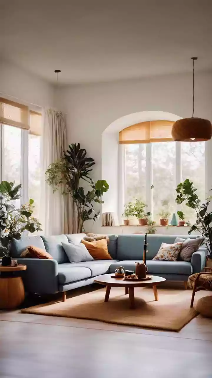
This colour trend is closely linked to the growing movement of biophilic design, which seeks to connect our indoor spaces with nature to improve well-being. Using an earth-toned palette is a simple way to foster this connection. Shades of green evoke forests, blues can mimic the sky and water, and browns and terracottas connect us to the earth itself. In India, where traditional architecture has long incorporated elements like courtyards and natural materials, this trend feels like a modern return to our roots. Paired with natural materials like wood, jute, rattan, and linen, these colours help create serene, healthy environments that reduce stress and improve air quality.
How to Embrace Natural Palettes
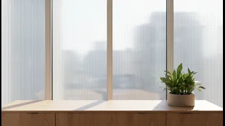
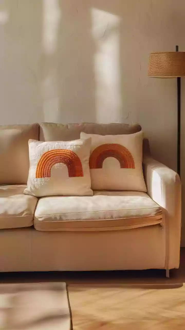
Adopting this trend doesn't require a complete overhaul. You can start small by introducing natural tones through textiles. Think terracotta or olive green cushions, a beige wool throw blanket, or a jute area rug. These elements add immediate warmth and texture. Introducing indoor plants is another easy way to bring life and natural green hues into your space. If you're ready for a bigger change, consider painting an accent wall in a warm, earthy shade or even painting all the walls in a soft, creamy off-white instead of a stark, bright white. The key is to layer different tones and textures to build a space that feels collected, comfortable, and authentically you.