







Decoding the Government Dashboard
The Ministry of Tourism has been enhancing its data infrastructure, offering public-facing dashboards and reports that provide a wealth of information. These portals, including initiatives like the National Integrated Database of Hospitality Industry
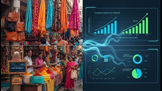
(NIDHI), aim to create a comprehensive snapshot of the country's tourism landscape. They compile statistics on domestic tourist visits, foreign tourist arrivals, hotel occupancy rates, and even the economic impact of tourism. For anyone trying to understand broad patterns—like which states are seeing the most growth or the breakdown of international visitors—this is an invaluable starting point. The goal is to support informed decision-making for everyone involved in the tourism ecosystem.
The Big-Picture Advantage
So, how can you use this high-level data? For travellers, it can reveal emerging destinations or highlight which states are popular during certain seasons, helping you either join the buzz or avoid the crowds. For content creators, these numbers provide a solid, data-backed foundation for storytelling. Instead of just saying a place is popular, you can point to official statistics showing a 23% year-on-year increase in searches for that region, adding credibility to your content. For small tourism businesses, like homestay owners or local tour operators, this data is crucial for market analysis. Understanding whether your state is attracting more domestic families or international solo travellers can help you tailor your offerings and marketing efforts far more effectively.
Why Numbers Don't Tell the Whole Story
However, relying solely on national or state-level data has its pitfalls. Official statistics, while comprehensive, often have a time lag and may not reflect the reality on the ground right now. A state might show a high number of tourist visits, but the data may not reveal that 90% of those visitors are concentrated in a single, overcrowded city, leaving other beautiful regions untouched and ripe for exploration. Furthermore, these large datasets won't tell you about a sudden road closure, a newly launched local festival, or that a popular beach has a temporary hygiene issue. These are the critical, real-time details that can make or break a trip or a content plan. The data provides the 'what,' but it often misses the 'why' and the 'how it feels' on the ground.
Bridging the Gap with Local Intel
This is where the second, crucial step comes in: seeking out local updates. In today's digital age, this is easier than ever. Follow regional travel creators on Instagram and YouTube, who often provide real-time, authentic reviews and visual proof of what a place is like this week. They are the ones showing you the hidden waterfall that’s not in the official guide or warning you that a popular viewpoint is overrun. Local news outlets, travel forums, and even Google Maps reviews can offer timely information on everything from new cafe openings to temporary closures. For businesses, connecting with local hotel associations or tourism boards provides a network for sharing immediate, practical information that national data can't capture.
A Practical Workflow for Smart Planning
To make the most of all available information, adopt a two-step research process. First, use the official tourism data portal to get your bearings. Identify a state or a broad trend that interests you. For example, the data might show that spiritual tourism is a fast-growing segment, with destinations like Rishikesh and Varanasi seeing a huge jump in interest. Second, dive deep with local sources. Search for hashtags related to that destination on social media. Look for recent blog posts or vlogs from creators who have just been there. Are they praising the serene atmosphere, or are they complaining about overcrowding post-monsoon? This combination of macro data and micro-level insight is the key. The government data gives you the direction, but the local updates provide the detailed roadmap.