



The 'Just Right' Brightness
The single most important rule for screen brightness is to match it to your environment. A screen that is much brighter or dimmer than your surroundings forces your eyes to constantly readjust, causing fatigue. In a typical, well-lit office, a brightness level
of around 250 to 350 nits (a standard measure of screen brightness) is often recommended. In a dimly lit room at night, you should lower your brightness significantly, perhaps to between 120 and 180 nits. If you're near a bright window, you may need to push it to 400 nits or more to maintain visibility without squinting. A simple test is to hold a white piece of paper next to your screen. If the screen glows like a light source, it's too bright. If it looks grey and dull, it's too dark. The goal is for the screen’s white areas to blend seamlessly with the ambient light.
Understanding Screen Glare
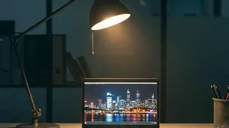
Glare is another major source of eye discomfort. It happens when external light from a window or an overhead lamp reflects off your screen, creating distracting bright spots and reducing contrast. This forces you to strain to see the actual content on the display. There are two main types of laptop screens, each handling glare differently: glossy and matte. A glossy screen has a smooth, reflective surface. While this allows for vibrant colours and deep blacks in a controlled, dark environment, it acts like a mirror in a bright room. A matte screen has an anti-glare coating that diffuses light instead of reflecting it directly. This significantly reduces distracting reflections, making it a better choice for most work environments like offices or brightly lit homes.
Matte vs. Glossy: Which Is Better for Comfort?
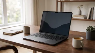
For long hours of reading, writing, or general productivity, a matte screen is generally considered more comfortable for your eyes. By scattering ambient light, it reduces the visual 'noise' your eyes and brain have to filter out, leading to less strain over time. The trade-off is that the anti-glare coating can make colours appear slightly less vibrant and text a little less sharp compared to a glossy display. Glossy screens are often preferred by photo and video editors who need maximum colour accuracy and contrast, and who typically work in carefully controlled lighting conditions. For the average user working in a variety of environments—from a sunlit café to an office with overhead fluorescent lighting—the practical benefits of a matte screen’s glare reduction usually outweigh the minor dip in perceived image punch.
More Tips for Reducing Eye Strain
Beyond brightness and glare, several other habits and settings can dramatically improve your eye comfort. First, position your screen correctly: it should be about 20–24 inches away from your face, with the top of the screen at or slightly below eye level. This promotes a more natural posture and reduces strain. Also, remember to blink. When staring at a screen, people blink about a third as often as they normally do, which leads to dry, irritated eyes. Making a conscious effort to blink more can help. Finally, embrace the 20–20–20 rule: every 20 minutes, take a 20–second break to look at something at least 20 feet away. This simple exercise allows the focusing muscles in your eyes to relax, preventing the fatigue that builds up from constant close–up work.