



Start With a Story, Not a Wall
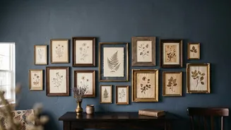
The most compelling gallery walls begin with a point of view. Before you source a single piece of art, think about the story you want to tell. Is it a tribute to your travels, with maps, postcards, and landscape paintings? Perhaps it's a celebration of nature,
featuring botanical prints and soft, earthy tones. Or maybe it's a personal history told through heirloom photos and handwritten letters. Defining a theme—whether by subject, color palette, or mood—provides a curatorial filter. This narrative thread is what transforms a simple collection of frames into a cohesive and meaningful display that feels genuinely you.
The Thrill of the Hunt: Sourcing Your Art
Building a vintage collection is a journey. The most personal displays are rarely bought in a single shopping trip. Flea markets, antique shops, and estate sales are treasure troves for original paintings, unique prints, and beautifully aged frames. Don't overlook pieces with potential; an interesting artwork in a dated frame can be transformed, just as a gorgeous vintage frame can be repurposed for a new image. Online marketplaces like Etsy and even Facebook Marketplace are excellent for finding both affordable vintage-inspired prints and authentic antique pieces. You can even mix in modern reproductions, personal photographs, or textiles to add layers and texture. The goal is to gather items that resonate with you, creating a collection that feels curated over time.
The Art of the Mix: Frames and Mediums
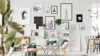
A dynamic gallery wall often relies on a masterful mix of frames, sizes, and orientations. While using all matching frames creates a clean, modern look, an eclectic mix often feels more personal and collected. A good rule of thumb is to limit your frame colors to two or three—such as black, natural wood, and gold—and repeat them throughout the display for a sense of unity. Don't be afraid to combine different materials and styles, pairing a sleek metal frame with an ornate wooden one. You can also add depth by incorporating three-dimensional objects like small mirrors, sculptural pieces, or even a tiny shelf for keepsakes. This variety in texture and shape is what gives a gallery wall its character and visual interest.
Designing for a Small Space
In a smaller home, a gallery wall can actually make a room feel larger and more intentional if done correctly. Drawing the eye upward with a vertical arrangement can make low ceilings feel higher. When hanging art above a sofa or console, a common rule is to ensure the collection spans about two-thirds of the furniture's width, with the lowest frame hanging 6-8 inches above it. This anchors the art to the furniture, creating a cohesive vignette. Using thin, lightweight frames and ensuring there is enough 'negative space'—or breathing room—around the arrangement prevents it from overwhelming the room. A consistent spacing of 2 to 3 inches between frames is a good guideline to keep the display looking polished and not cluttered.
The Practical Magic: Planning and Hanging
Before you hammer a single nail, plan your layout. A foolproof method is to trace each frame onto craft paper, cut out the templates, and tape them to the wall with painter's tape. This allows you to visualize the arrangement and make adjustments without creating unnecessary holes. Once you're happy with the layout, start by hanging your largest, or 'anchor', piece first, typically with its center at eye level (around 57 inches from the floor). Then, build the rest of the arrangement around it. Use a level to ensure straight lines, but don't obsess over perfect symmetry; a slightly asymmetrical layout can often feel more organic and relaxed. Trust your eye and focus on creating a balance that feels right for your space.