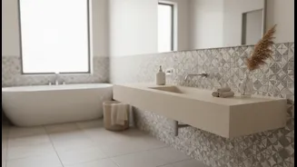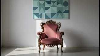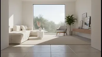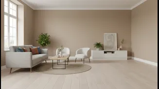







The Psychology of a Cohesive Palette
A unified color scheme does more than just look good; it feels good. Our brains are wired to seek patterns and order, and a cohesive palette provides a sense of visual calm. When colors flow harmoniously from one room to the next, it reduces visual noise
and creates a feeling of intentionality. This doesn't mean every room has to be the same color. Instead, it's about creating a family of colors that relate to each other, making the entire home feel like a single, thoughtfully designed entity. This sense of order is often perceived as luxury; it suggests that every choice was deliberate, contributing to an atmosphere of elegance and sophistication. By sticking to a defined palette, you're creating a subtle narrative that guides the eye and soothes the mind.
Building Your Core Color Story
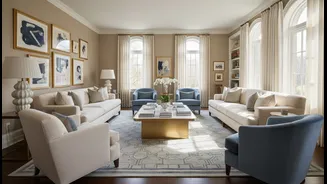
Creating a palette isn't about restriction; it's about creating a framework. The most common and effective guideline is the 60-30-10 rule. This simple formula helps balance colors within a space. Start by choosing a dominant color, which will make up about 60% of your room—think walls and large furniture pieces. This is often a versatile neutral like a warm white, greige, or soft gray that can act as a foundation throughout the home. Next, select a secondary color for 30% of the space. This could be used for curtains, accent chairs, or even a feature wall, providing contrast and interest. Finally, the last 10% is for your accent color. This is where you can be bold with a pop of color on throw pillows, art, and accessories to add personality.
Coherence, Not Exact Matching
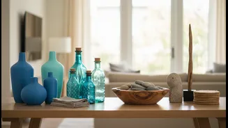
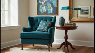
A common misconception is that a cohesive palette means using the exact same shades everywhere. This can lead to a flat, uninspired look. The secret to a rich, collected interior is to play with different tints, tones, and shades of your chosen colors. For instance, if your secondary color is blue, you don't have to stick to one shade of navy. You can introduce lighter sky blues in one room and deeper, moodier teals in another. As long as they share a similar undertone (either warm or cool), the colors will feel connected. This approach creates depth and complexity, making the design feel more layered and sophisticated. It's this variation within a theme that separates a truly designed space from one that simply matches.
Weaving the Thread Through Your Home
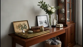
To create that desirable flow, your palette should travel with you through the house. An accent color in the living room could become the main wall color in the adjoining powder room. The wood tone from your dining table could be repeated in the picture frames in the hallway. This repetition creates a subtle 'red thread' of continuity that ties the spaces together. You can vary the proportions in each room to give each space its own identity while still feeling connected to the whole. For example, a room might be 60% neutral with a 10% pop of green, while the next room might use that same green as its 30% secondary color, creating rhythm and interest without feeling repetitive.
Let Texture Do the Talking
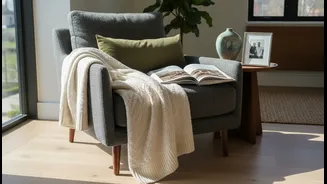
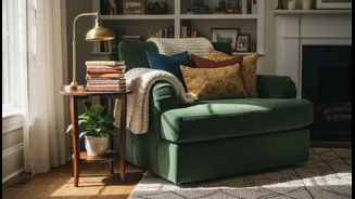
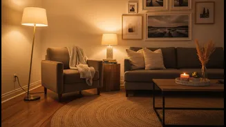
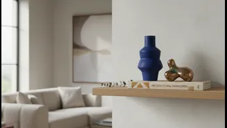
When you limit your color palette, another element becomes your secret weapon: texture. A room with a restrained color scheme of creams, beiges, and woods could feel boring. But add a nubby wool rug, a smooth leather chair, velvet cushions, and linen curtains, and the space suddenly feels rich and dynamic. Texture adds visual weight and interest, preventing a monochromatic or neutral space from feeling flat. Combining different finishes—like matte walls, a high-gloss vase, and brushed brass lighting—also adds a layer of sophistication. In a cohesive palette, the interplay of textures is what creates the sense of depth and luxury that makes a home feel truly collected and personal.